India Mahdavi puts modern spin on 145-year old patisserie, Ladurée
/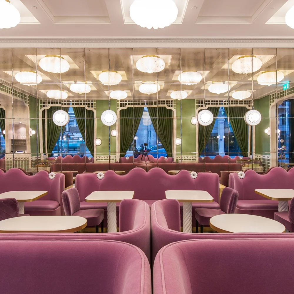
In true French fashion, the elegantly chic, playfully unexpected space blends a mix of pastels in a veritable Alice in Wonderland dreamscape.
Read MoreIn true French fashion, the elegantly chic, playfully unexpected space blends a mix of pastels in a veritable Alice in Wonderland dreamscape.
Read MoreJackalope Hotel is a surreal sensory journey of otherworldly proportions.
Read MoreOnion brings legit monkey bars and punching bags to Inteltion’s Bangkok offices.
Read MoreMelbourne-based Mim Design uses their Midas touch to transform a former 1950s garage into a buzzing café and coffee roaster.
Read MoreWillie Wonka himself couldn’t have topped this cream dream.
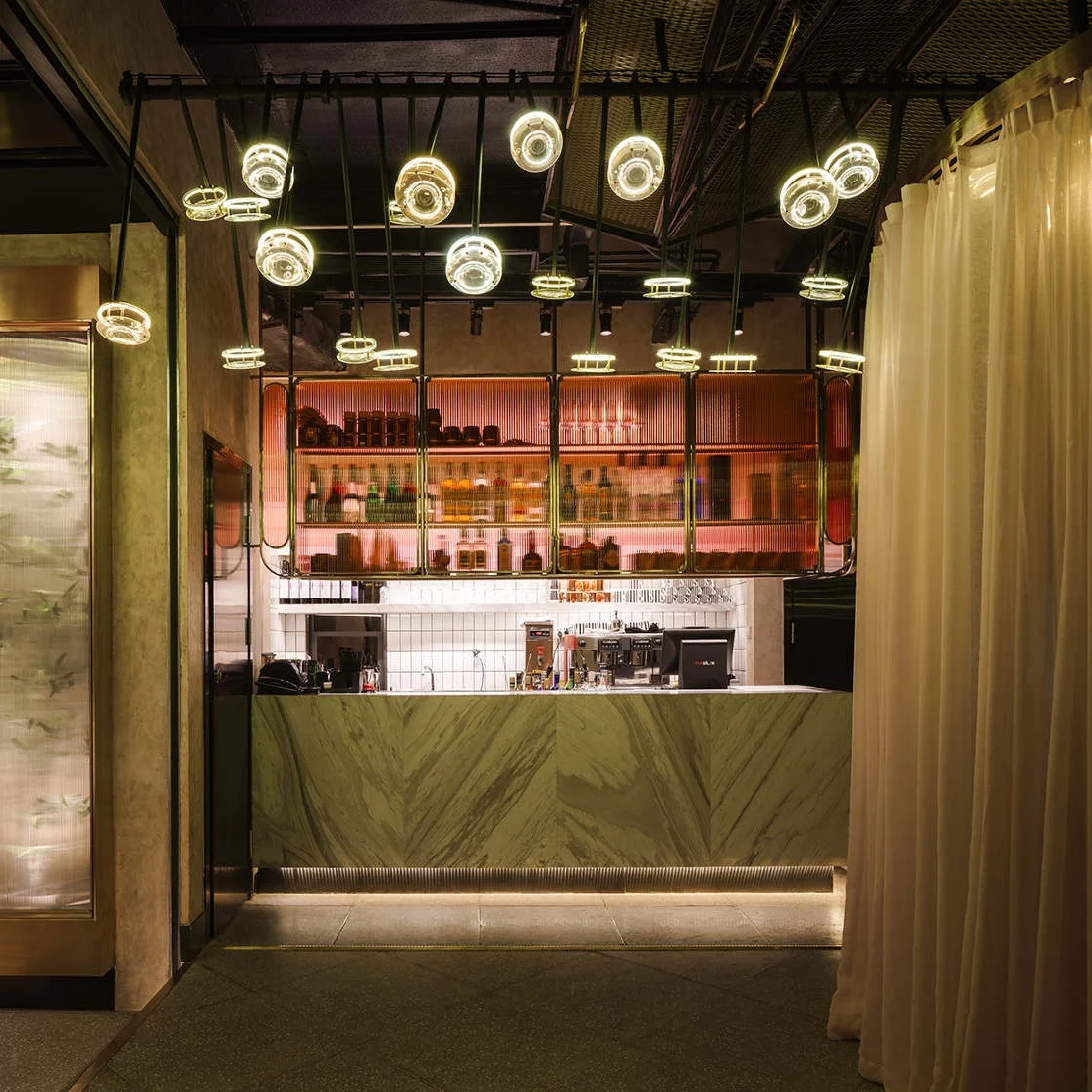
Read MoreTwo Times Elliott dialed in glossy marble floors, brass accoutrement, and velvet for days, creating Insta-worthy hideout, Disrepute
Read MoreMasquespacio just transformed a cleanup on Aisle 7 into art form.
Read MoreRife with tactile cues, the Hangzhou-based eatery is clad in emerald and sapphire velvet, rose gold mirrors, and luxe marble touches.
Read MoreLocated in the heart of Helsinki, the two-story café is a latte lover’s dream, boasting its own in-house micro roaster and a triad of cozy, backlit nooks.
Read MoreThe Spanish design agency created a mercurial space that transforms from morning lattes to late night sangria with ease.
Read MoreThe Shanghai eatery merges raw concrete with sleek finishes, embodying a visual journey through her day and the clandestine locales where she rubs shoulders with enigmatic strangers.
Read MoreNémeau takes cues from the pioneering spirit of Twenty Thousand Leagues Under the Sea in a modern journey of the senses.
Read More