Rafael De Cardenas First Furniture Collection
/The main reason why we are huge fans of Rafael De Cardenas is because one small glimpse at his designs is like a giant bolt of energy!
A few months ago KNSTRCT sat down with the designer for an interview in Soho. De Cardenas has the wonderful ability to keep mum about his future endeavors; never giving away too much, and yet always piquing your interest. That day in Soho was no different. When I asked him what was next for his design firm, Architecture At Large, he nonchalantly mentioned a new…(seemly minuscule) furniture line and then he suddenly changed the subject. We should have taken that as a hint that his new furniture line was going to be loud, full of color, and epic!
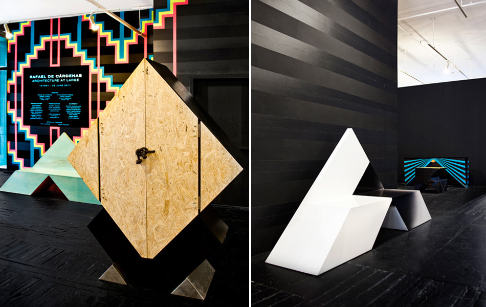
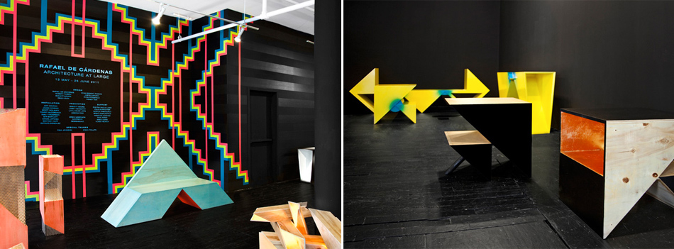
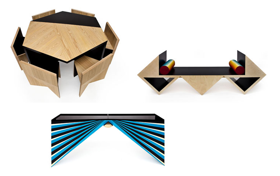
De Cardenas’ furniture collection was unveiled for the first time last Friday at the Johnson Trading Gallery in New York City. We had the pleasure of experiencing each piece up close and personal over a few liquid libations. Plywood, neon gradients, and veneered cypress were used in the collection, staying true to the designer’s signature aesthetic and penchant for bold lines, color and contrast.
Rafael finds beauty in simple materials, like plywood, and gracefully dresses them in high style. This unique ability has helped launch his career during a time of lesser means. During our last interview, the designer was optimistic when discussing the economic recession, as he is confident in his ability to create with or without funds. He explained, “I don’t think that money is the thing that prevents design from happening, it presents challenges…and you always need some resistance in the design process or you are kind of operating in a vacuum.”
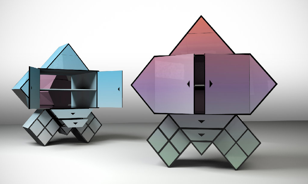
De Cardenas went on to list some of his favorite design materials, namely tape, paint, and plywood. Two out of three are abundant in his furniture collection, which he describes as “a homage to Bruce Goff and Frank Lloyd Wright, the furniture in this collection takes the cube as the underlying structural form. Through rotation, mirroring and multiplication, each piece is composed from an uncomfortably simple set of relationships – cubes fastened by triangular or semi-circular forms– that are both decorative and essential structural elements.” We’re dong our best to stay focused on his design concept, but we’re lost in a daydream about The Hulk Cabinet (see first image). It would be the perfect piece of eye candy for the office!


