Visioarq designs dreamy seaside escape, QL House
/
A play on proportions, the residence sits on a sprawling plot of land in Algarve, Portugal’s Southern coast.
Read MoreA play on proportions, the residence sits on a sprawling plot of land in Algarve, Portugal’s Southern coast.
Read MoreAptly titled, “Baked by the Heat,” the decidedly modern family home was completed on a sweltering day when the mercury hit 104˙F.
Read MoreA standout amongst the conventional homes of São Paulo, Fernanda Marques Arquitetos reimagines the traditional country home with a structural boldness.
Read MoreFrom plunge pool to lily-strewn reflection pond, Renato D'Ettorre Architects spared no expense in creating the quintessential coastal abode.
Read MoreNext-level prefabrication, structural modules for the remote Vancouver home were shipped via barge and transported to the site by twenty-three trucks.
Read MoreThe structural principles of Chinese architecture, with the exception of decorative details, have remained largely unchanged...
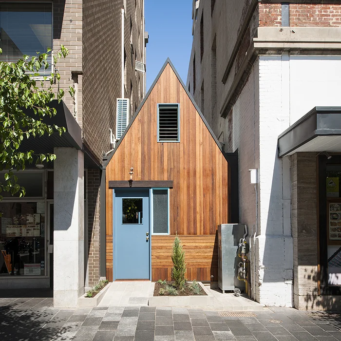
Read MoreAdelaide’s new Pink Moon Saloon is so small it stands out. Slid between two commercial buildings in a narrow bin alley running off...
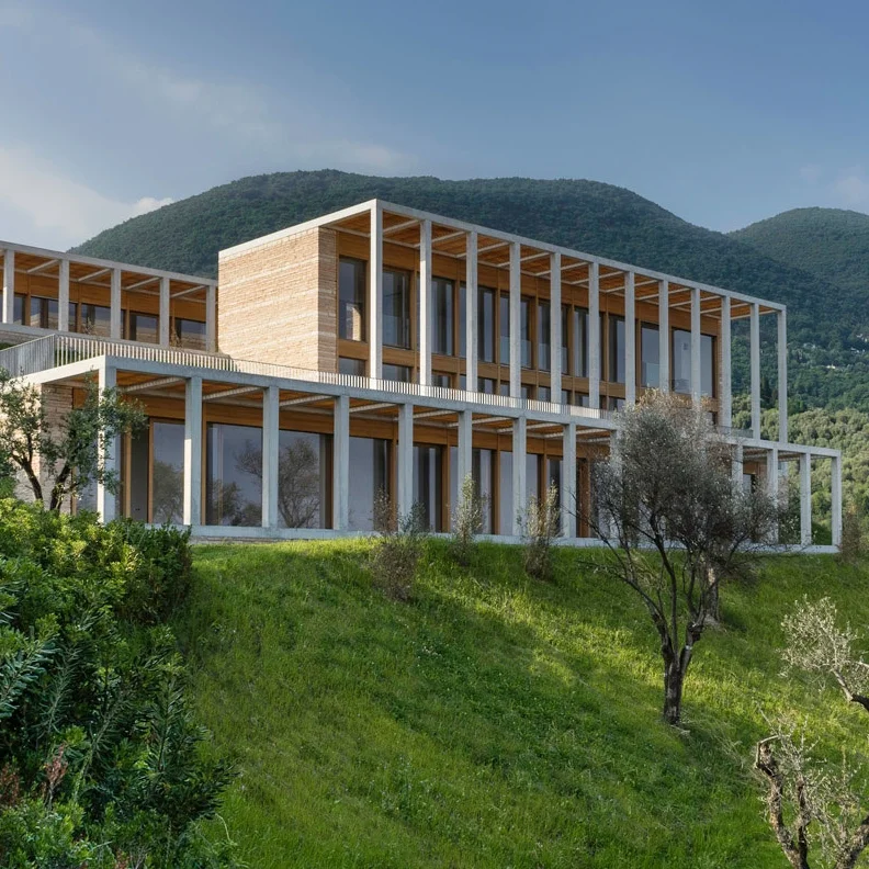
Read MoreOn the western shores of Italy’s Lake Garda, where the cool weather evokes a richly cultivated landscape...
Read MoreThis is Michael Bay’s L.A. Villa. But it wasn’t always. Chad Oppenheim, founder of Miami-based architecture firm Oppenheim...
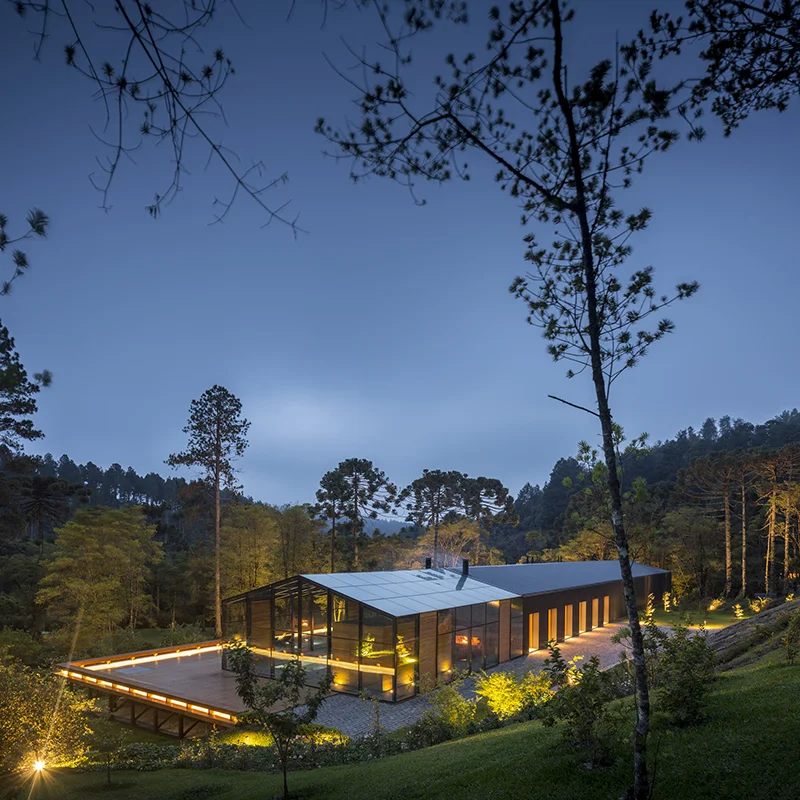
Read MoreIn the dense, mountainous region, outside the bustling city of São Paulo, Architect Marcio Kogan explored the duality of...
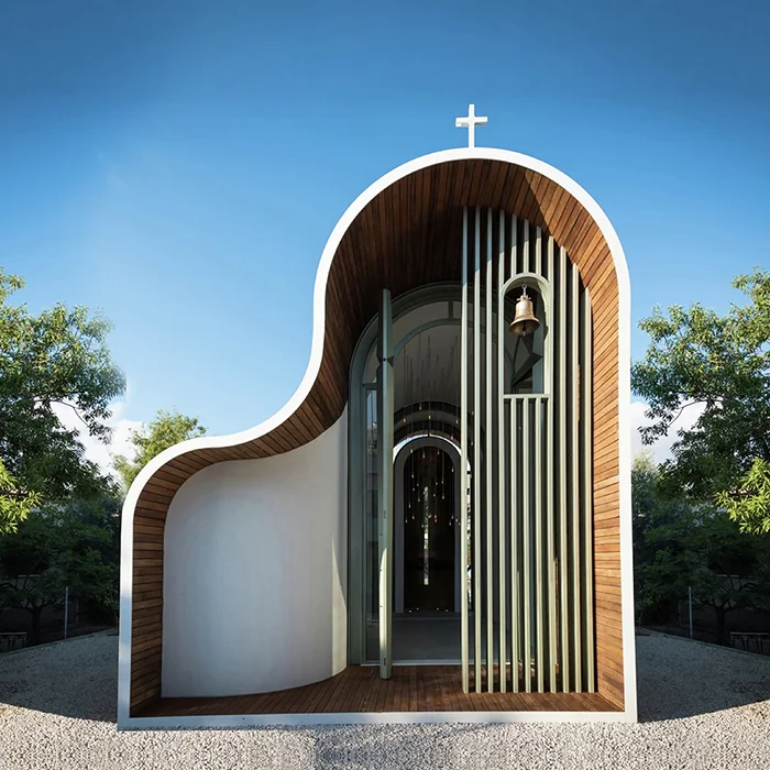
Read MoreWhile massive, power-house churches are on the rise, it’s refreshing to know that some worshipers are straying from the pack and seeking...
Read MoreBefitting a regionally based sculptor, Sawmill House is a handcrafted upgrade from his existing rather rustic bohemian abode designed by architecture firm Archier.
Read More