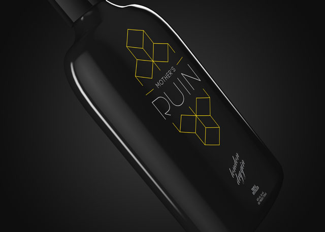
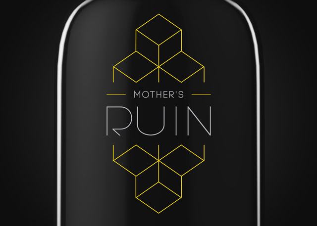
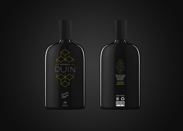
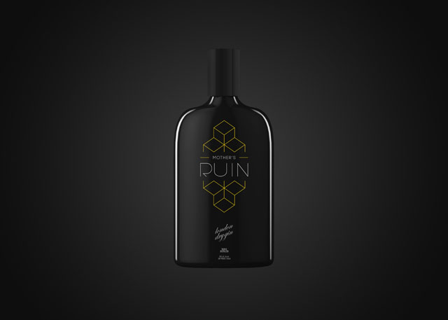
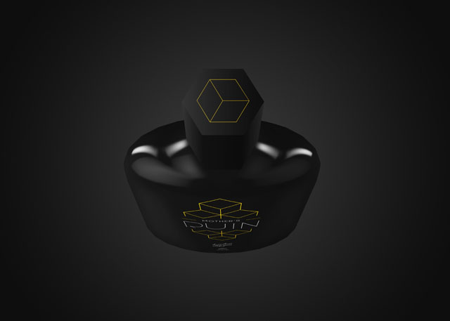
Mother’s Ruin Gin
/It’s not often you don’t see gin packaged in a horribly tacky bottle with garish colors and a dated, turn-of-the-century looking script font (Enter the train wreck that is Seagram’s).
Well, look no further. Mother’s Ruin Gin gives the traditional trashy gin packaging a much-needed facelift. Gone is the gold foil and Old English. (Phew!) Daniel Brokstad stripped the branding down to its barest essentials. A clean, modern sans serif typeface, geometric lockup and minimalistic color scheme grace the sleek, black bottle. As the bottle boast it’s, “bound to please.” If the gin is as smooth as the branding, we have no doubt it will.