Branding & The Built Environment: Isabel Marant
/There is a secret to telling your brand’s story. Even with a massive e-commerce boom, creating an experience that allows you to connect with customers in a physical space has the capability of communicating your brand message in a way that cannot be replicated in the digital realm. Today, we are diving into the retail experiences of French-fashion house Isabel Marant, crafted by Parisian creative studio Ciguë.
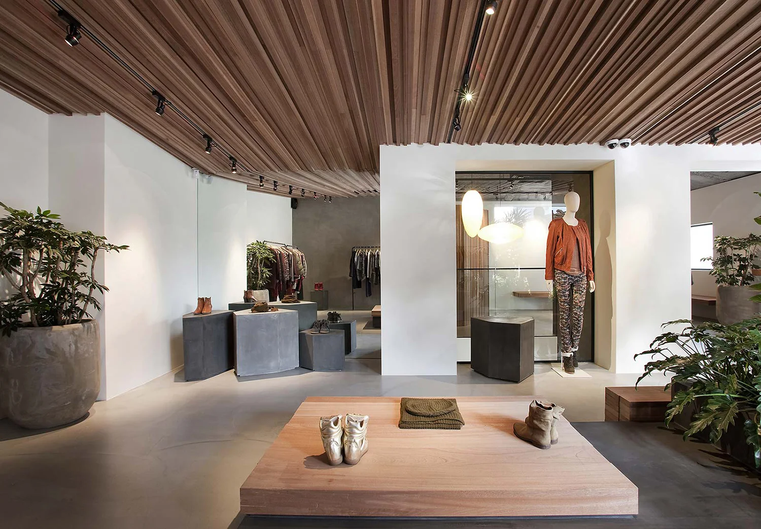
Seoul store || Design: Cigue || Materials: concrete, plaster, sapele wood, steel, and granite || Plants: Ficus umbellata, Monstera, Artcarpus altilis
Since fashion designer Isabel Marant revealed her first collection in the spring of 1995, she grew her brand slowly and organically, step by step, in order to maintain full freedom and honesty in her work. With a vision of crafting clothes that are accessible and not overly girly or elaborate, Marant builds staple garments such as skinny jeans, elegantly destroyed slouchy knits, furs and shearlings, menswear pieces, and perennial "It" items like fringed boots and wedge sneakers that capture the confidence and nonchalance of French street style. Feminine but never overtly sexy, Marant's attitude informs a combination of minimalist, bohemian, and utilitarian style currents that is never over thought.
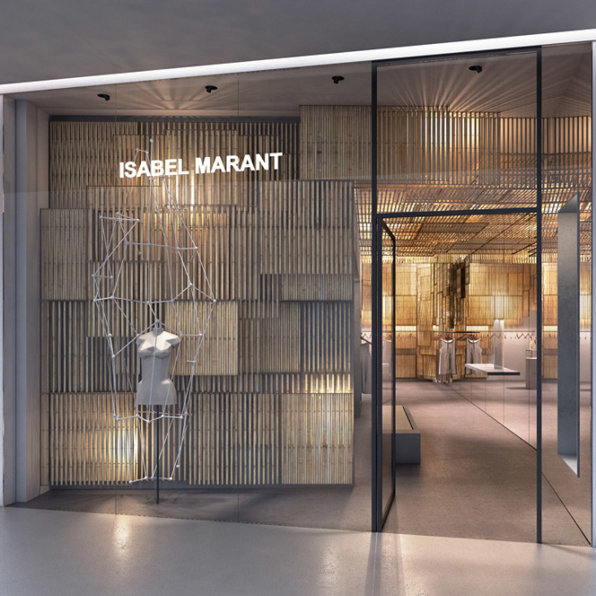
Marant called upon local design studio, Ciguë, to re-create the brand’s identity into the built environment for their Paris, Tokyo, Shanghai, Seoul and Bangkok outposts. The brand's identity transcends into the design of each store through classic materials, immersive experiences and eye-catching displays.
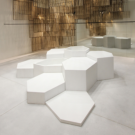
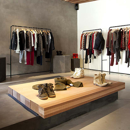
When it comes to architectural design, Marant favors oak, grey concrete, black steel, Charlotte Perriand and Jean Prouvé. Ciguë approaches the design of Marant’s stores with a clean and minimalist aesthetic, employing a creative use of product displays and window design. Utilizing regular materials in an interesting way is something the Isabel Marant brand does best.
Paris store || Design: Cigue || Materials: concrete, plaster, steel, oak and felt || Plants: Ficus Elastica
Shanghai store || Design: Cigue || Materials: Hainut blue stone, oak, brass and steel
Tokyo store || Design: Cigue || Materials: fiber-glass resin, concrete, pine wood, plywood, steel, and leather


