Conradt Optik by Ippolito Fleitz Group
/Snapshot: New owners of Conradt Optik contracted Ippolito Fleitz Group for a new design that would communicate their business philosophy of selected brand displays married to peak customer service.
In 2009 the Mosbach, Germany optical retail outlet Conradt Optik passed to new owners who oriented the refurbishment around a dual business philosophy of product presentation and customer guidance, contracting Berlin firm Ippolito Fleitz Group to create a design equally suitable to suave displays and individualized customer service. Their secret was to make the store as organic as the humans who would be drawn in to it.
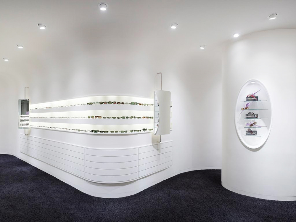
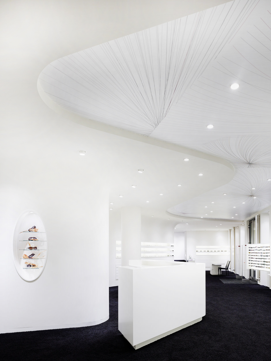
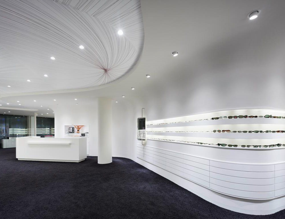
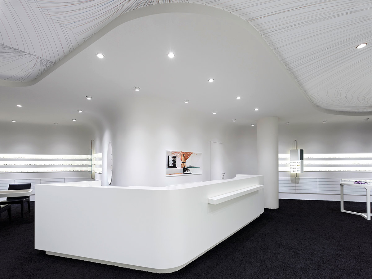
Even a passing glance of the look of Conradt Optik is quite enough, in its own right, to draw in the passersby through one of its two entrances, each of which leads to a central receptacle housing the main, L-shaped service counter, which lies amongst a glisteningly illuminated interior of white walls and liberally-used backlights dynamically countered by a black carpeted floor. The entrances are equidistant from the main counter, the accessibility being an essential feature of the organic design but by no means the standout one: while the design’s versatility is predicated upon its organic quality, the swerves and curves that immediately confront visitors’ senses are appealing in their own right while functioning as the spatial demarcations appropriate to a retail outlet and also containing within their contours various storage and display areas.
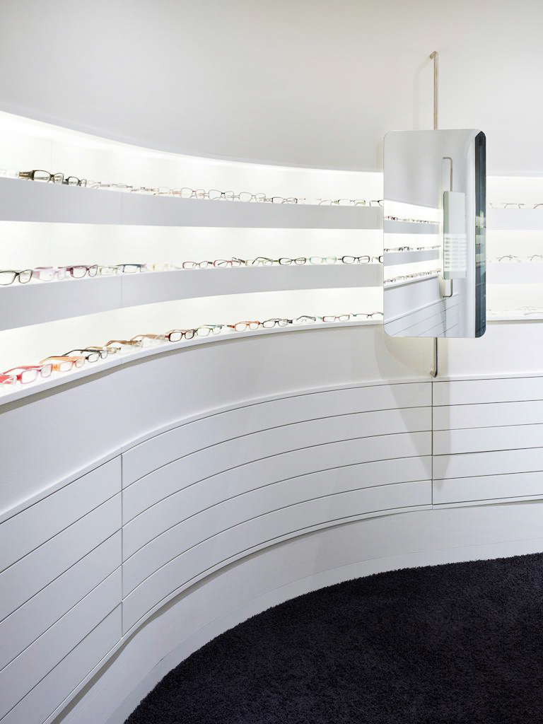
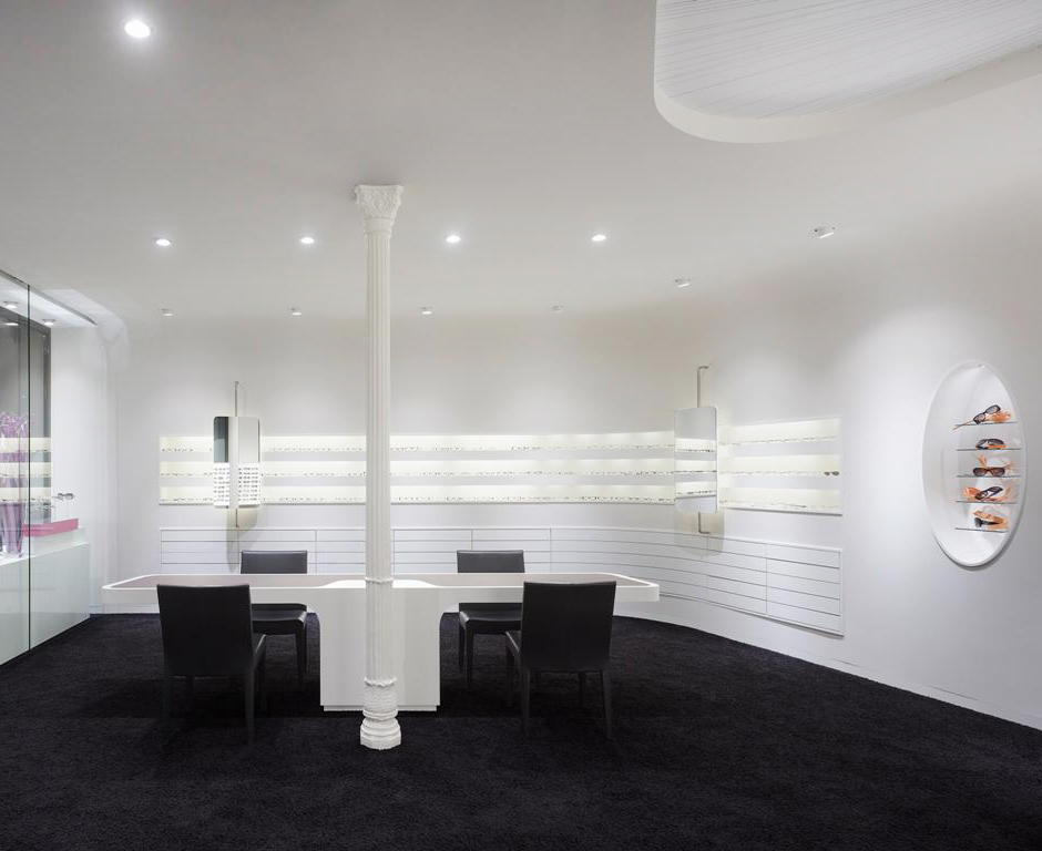
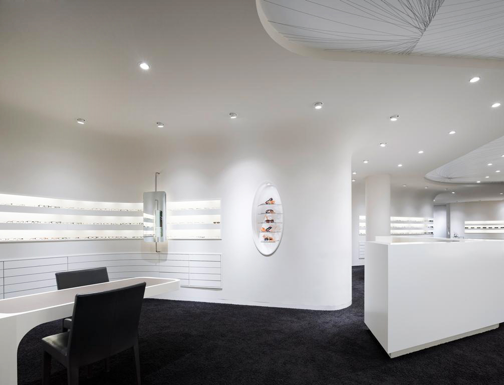
The largest of these organic curvatures formulates a winding rear wall that masks workshops in the back while segmenting the main interior receptacle as well. Inset drawers that lie flush with this back wall provide storage space while an illuminated presentation display run the gamut of one of the central curvatures, and is punctuated by two vertical swivel mirrors, one here and the other there. The backlights are most evident in this display and illuminate the eye wear perfectly, conforming to Conradt Optik’s desire to present a specialized segment of brands, each of which is, with this design choice, individualized and unique, standing apart from even its next-door neighbor on the shelf.
The ceiling decor radiates a spindle pattern of very fine, multi-colored lines that wonderfully accent the white surface, as well as stylistically demarcating the customer service from the shopping areas; a nice touch, since such a demarcation is usually more evident and, well, on the floor.
The non-uniformity is a welcomed architectural strategy, each part of the store essentially nuanced in a way that reinforces the versatility factor while inviting exploration throughout its entire interior. This non-uniformity is all-permeable: that enormous display case is categorically different from this curvaceously sleek one, while both stand apart from ovular one inset into a free-standing cylindrical column. One can only imagine what the workshops in the back are like.
For such a small space, the Ippolito Fleitz Group does a magnificent job creating a living, breathing outlet lit up as much by its vivacity as by its backlights. The care and dedication is more than evident and delightfully contrasts with that of a typical eye care/apparel store, or really any hole-in-the-wall business purporting to offer peak customer service--which they may do, but Conradt Optik clearly matches customer service with customer experience.
