Architecture Verte + Design Urbain: Place Québec by Atelier 21 Architects
/Canadian firm Atelier 21 conducted an extensive renovation of Quebec City’s “Place Quebec” in the 900 Rene-Levesque boulevard building. Led by design architect Hughes Desbiens, the redesign brings the natural daylight afforded by suburban shopping complexes city-side by injecting the same lighting and architectural dynamics into the street-level vestibule of Place Quebec and maintaining that allure throughout the extensive underground environment.
An underground shopping concourse linking the Hilton hotel to a convention center and three proposed office towers, called “Place Quebec,” had been built in 1971 on a then-modern bedrock of efficiency and functionalism. The intent of the designers, Architects Collaborative, was for pedestrian traffic to be alleviated of weather constraints, which in the winter months required tedious amounts of warm clothing that obstructed mobility, and while initial enthusiasm reigned over achieving this functionality, pedestrians soon lapsed into criticism over the starkly cave-like bronze interiors, the low ceilings, and the short width of the underground hallways, which eventually created more claustrophobia than functionality. Because only one of the proposed office towers was ever built, pedestrian traffic was too low to maintain a clientele for the shops, which eventually closed down and were absorbed into the neighboring congress center of Parliament Hill.
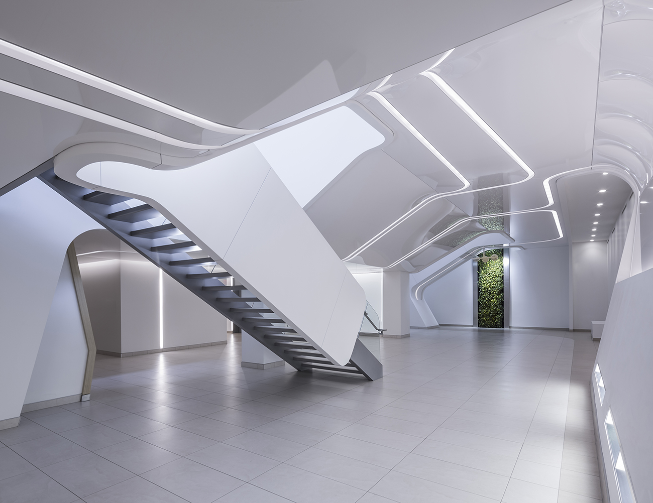
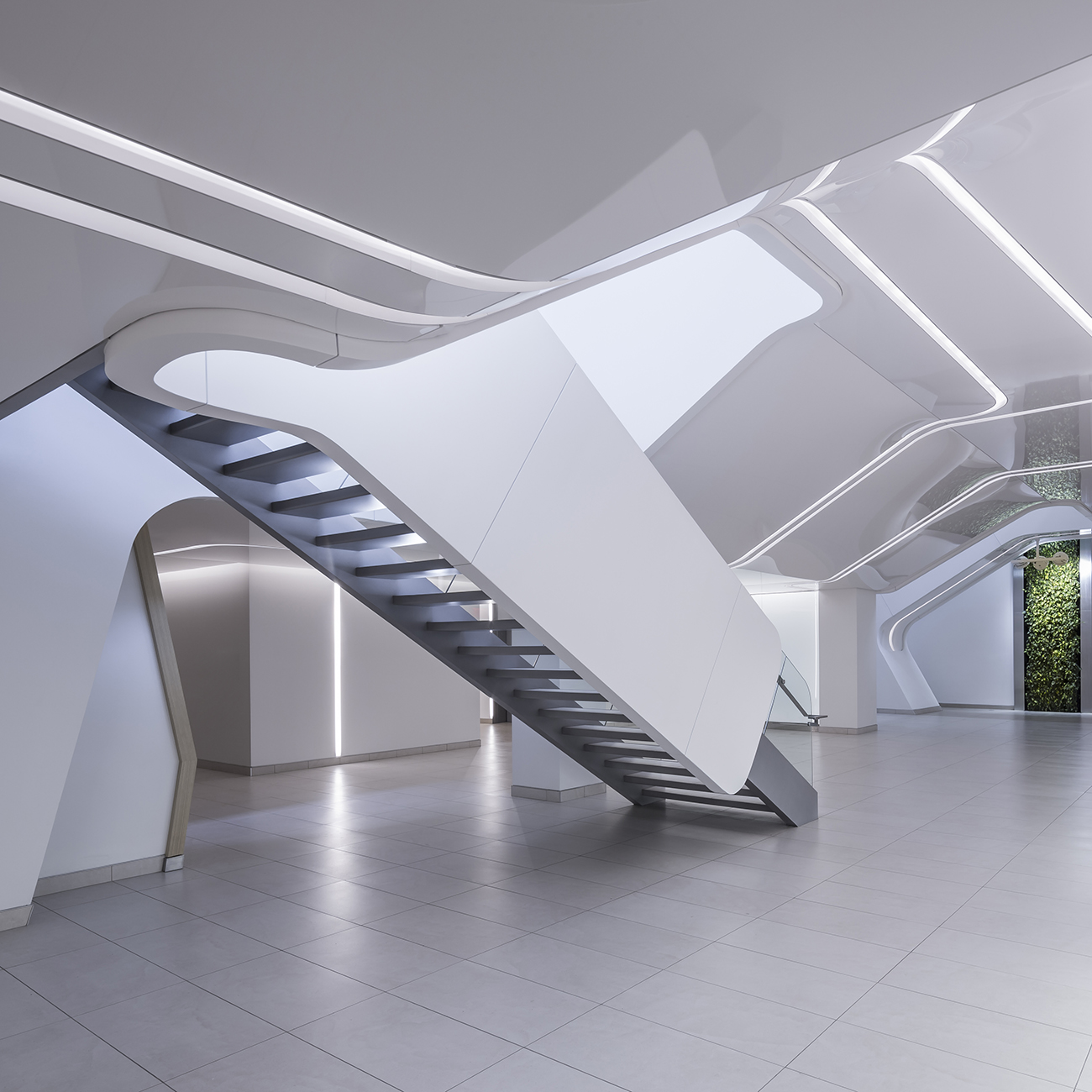
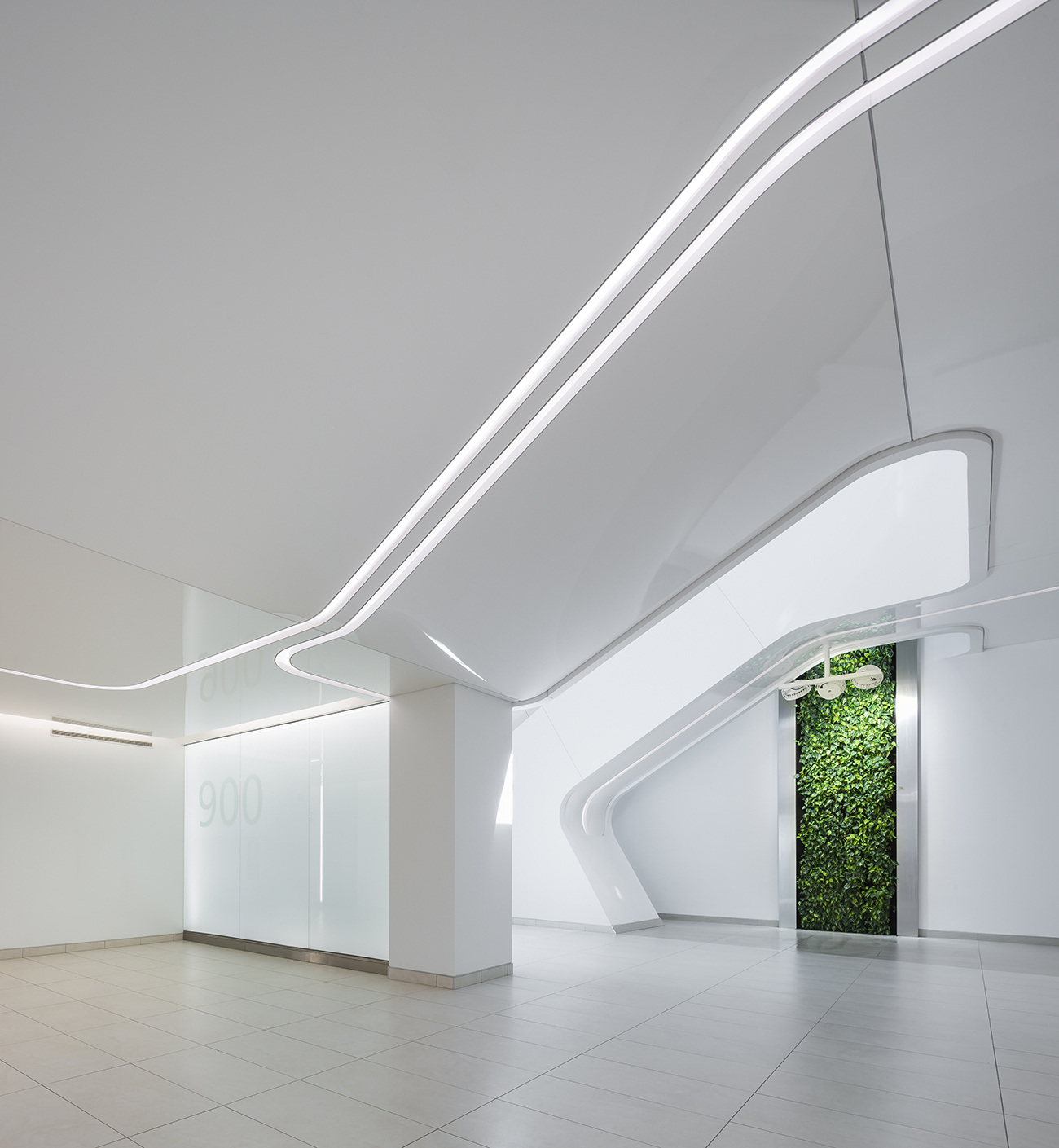
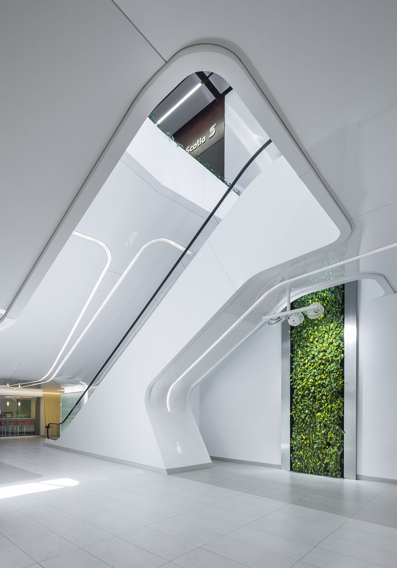
Atelier 21’s redesign truly manifests their suffixed title “Architecture Verte + Design Urbain,” creating a futuristic and dynamic space within the confines of an urban environment where things like natural daylight and flora are often obstructed, if not absent in some places. They invigorate this dingy seventies-era shopping space with a new, aesthetically attractive life. The street-level lobby, pedestrian’s first interaction with the underground concourse, is now transparent to the outside, which communicates an enticing tone that truly permeates the entire Place Quebec. The vestibule is now all-glass and outfitted with an indoor bus-stop. The escalators were replaced by a single one running up, while the below-ground stretches are accessible from this vestibule via a stairway which a tender declivity, all of which is illuminated with natural light from the redesigned lobby. The transition from street to shops is rendered much more seamlessly attractive than the stark barriers that previously separated the two.
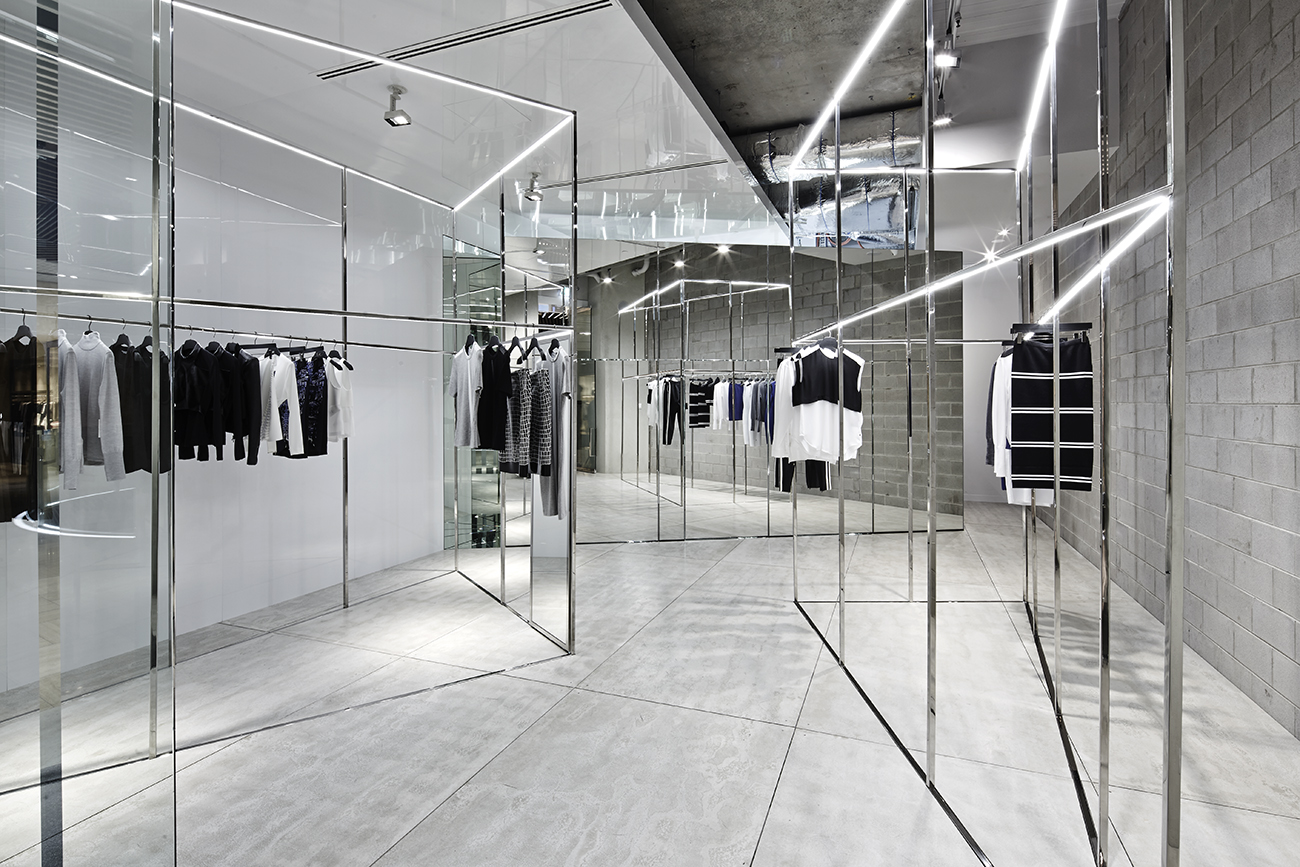
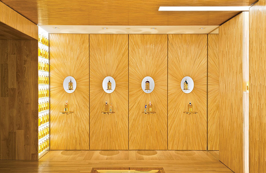
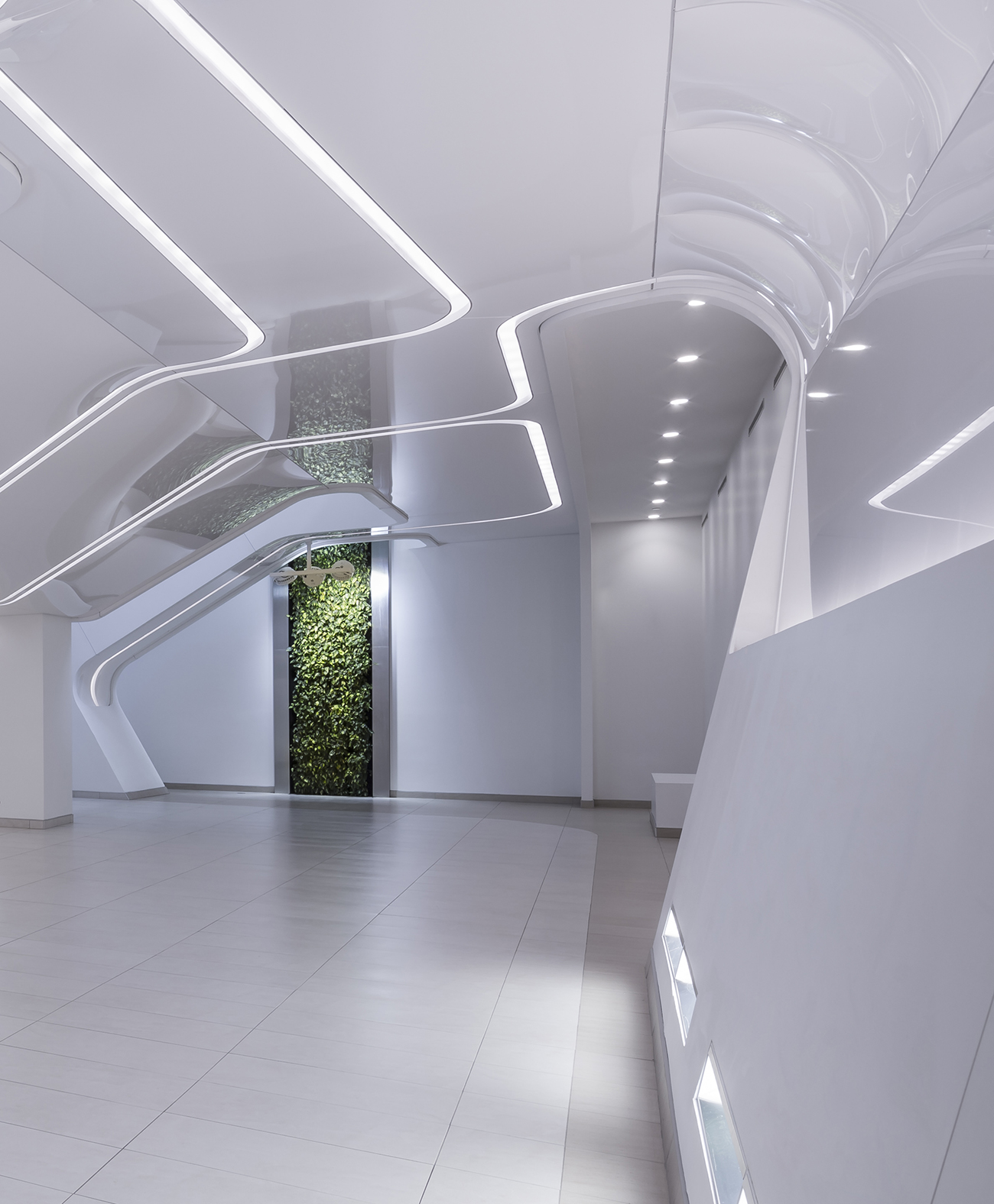
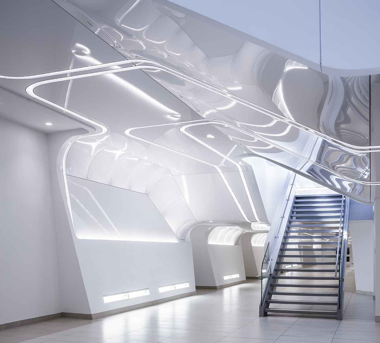
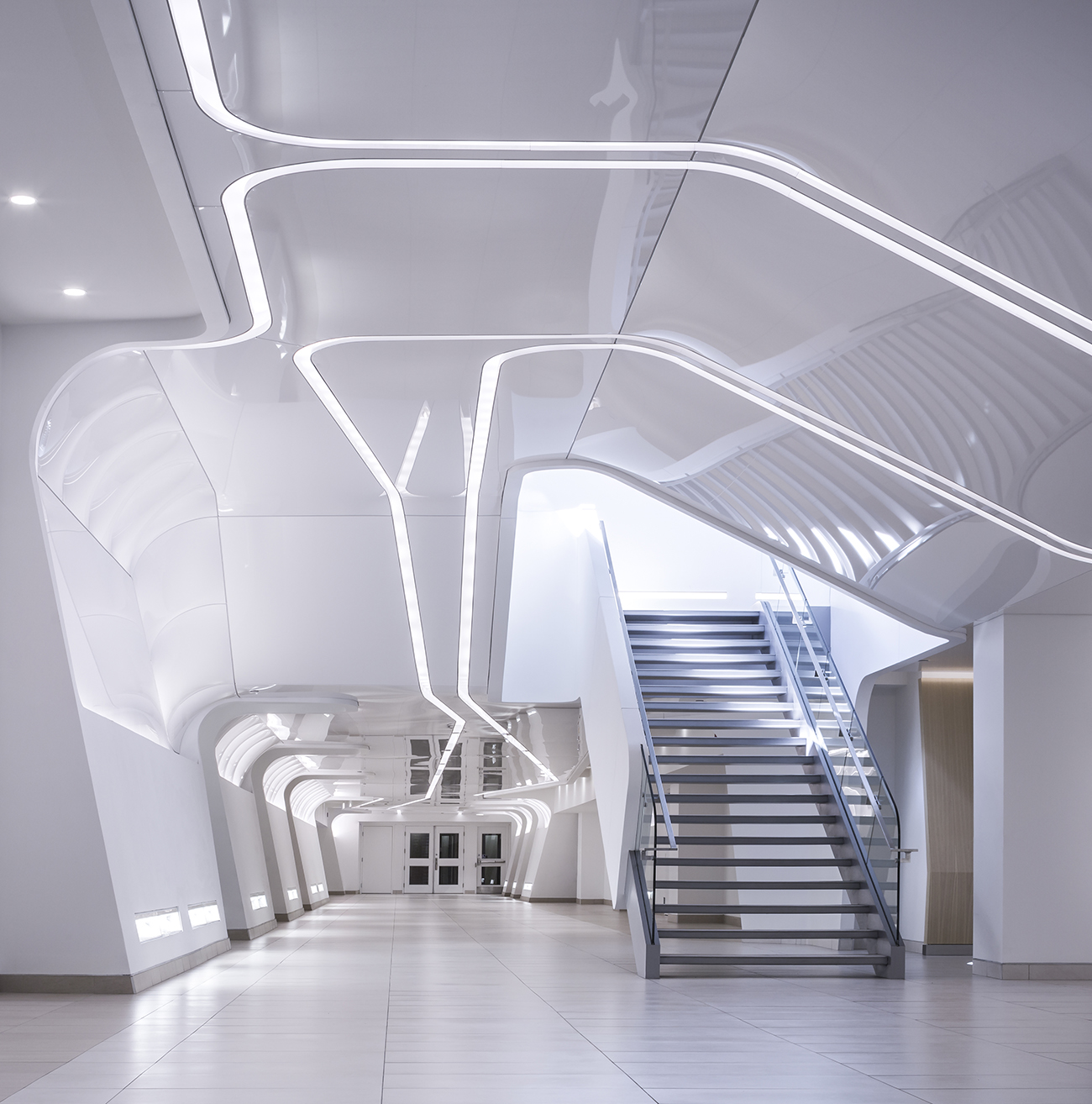
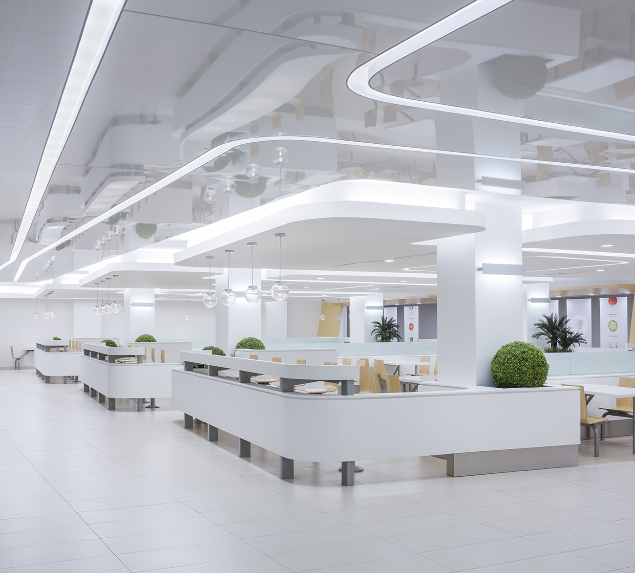
The underground shopping area immediately confronts visitors’ senses (not just ocular) with a clean brightness that is both practical and artificial, as the natural lighting effect of the street-level vestibule is here extended via artificial means. The former design divided the concourse into modulated compartments, while A21 creates segments the space with walls and ceilings that are either linearly diagonal or curved. The glossy walls and ceilings easily adapt to these lineaments and create a membranous surface that runs through the environment, stopping here and there to allow for the nuanced wood paneling that signals certain key areas like the food court or shop entrances. The surfaces allow the light to literally possesses the walls and ceilings which, amazingly, is designed to never disorient shoppers, and in addition, extends the illusion of height whose restriction was all too visible in the prior design. The diagonal walls do something similar for the width, which was previously constricted though now appears with a fuller dimension.
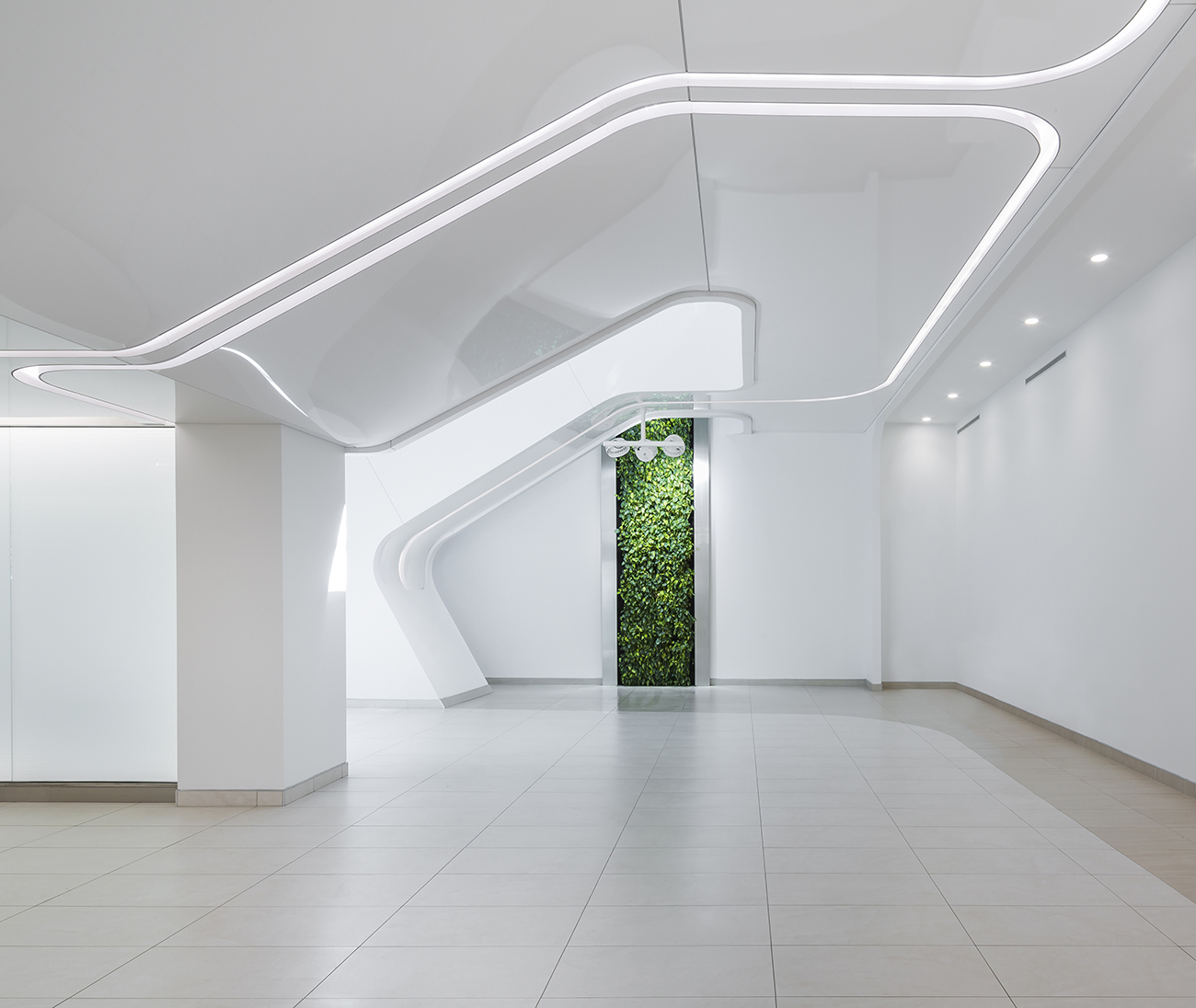
In the seventies the underground concourse bore no denial of its artificiality, to the structures detriment. A21 fabricates a new environment whose artificiality mimics and homages natural daylight and the sleek, clean modernity of urban spaces. The flora is the most standout element of their success. Green and white is an aesthetically pleasing color scheme in and of itself, but just as tree lined streets are important to eliminate the drab of closely packed urban spaces, plant life is important to nuance the futuristic architecture of Place Quebec with an optimistic naturalness, and so, plants sit atop counters or occupy niches alongside walls and junctions. This adds the warmth achieved by both the bright white walls (sometimes shining, sometimes monochromatic) and the accents of wood paneling.
Seventies era architecture championed functionalism often at the expense of sensory appeal, but Place Quebec illustrates that functional lifestyle only goes so far in maintaining an appeal. It’s a mutually-affirming testament to humanism generally and to the aesthetic dimension of architecture, as A21 have have paid their tribute to both in this extensive, futuristic, ethereal renovation that creates a white-washed glowing Heaven out a functional Hell.
Photography by Stephane Groleau
Related Stories:


