Child's Play: Arthur Casas Designs A Rainbow Twisted Kids Book Den for Saraiva
/While the larger part of São Paulo’s Saraiva Bookstore is a traditionally contrived linear structure, the children’s section departs from tradition into the realms of comfort, vibrancy, and imagination. Arthur Casas helmed the bookstore project and turned out a design that quite brilliantly recalls South American indigenous architecture such as temple forums and columns. For the layout of the children’s section, he incorporates the standout elements of his primary design formula and reconfigures them, by enunciating colors that are present elsewhere in the bookstore albeit less distinctly, or obliquely altering the linear designs that form the geometric bedrock upon which the bookstore takes shape. The end result is that both the layout and the colors of Saraiva Bookstore’s children’s section hearken to a wonderland phantasmagoria of childhood dreams.
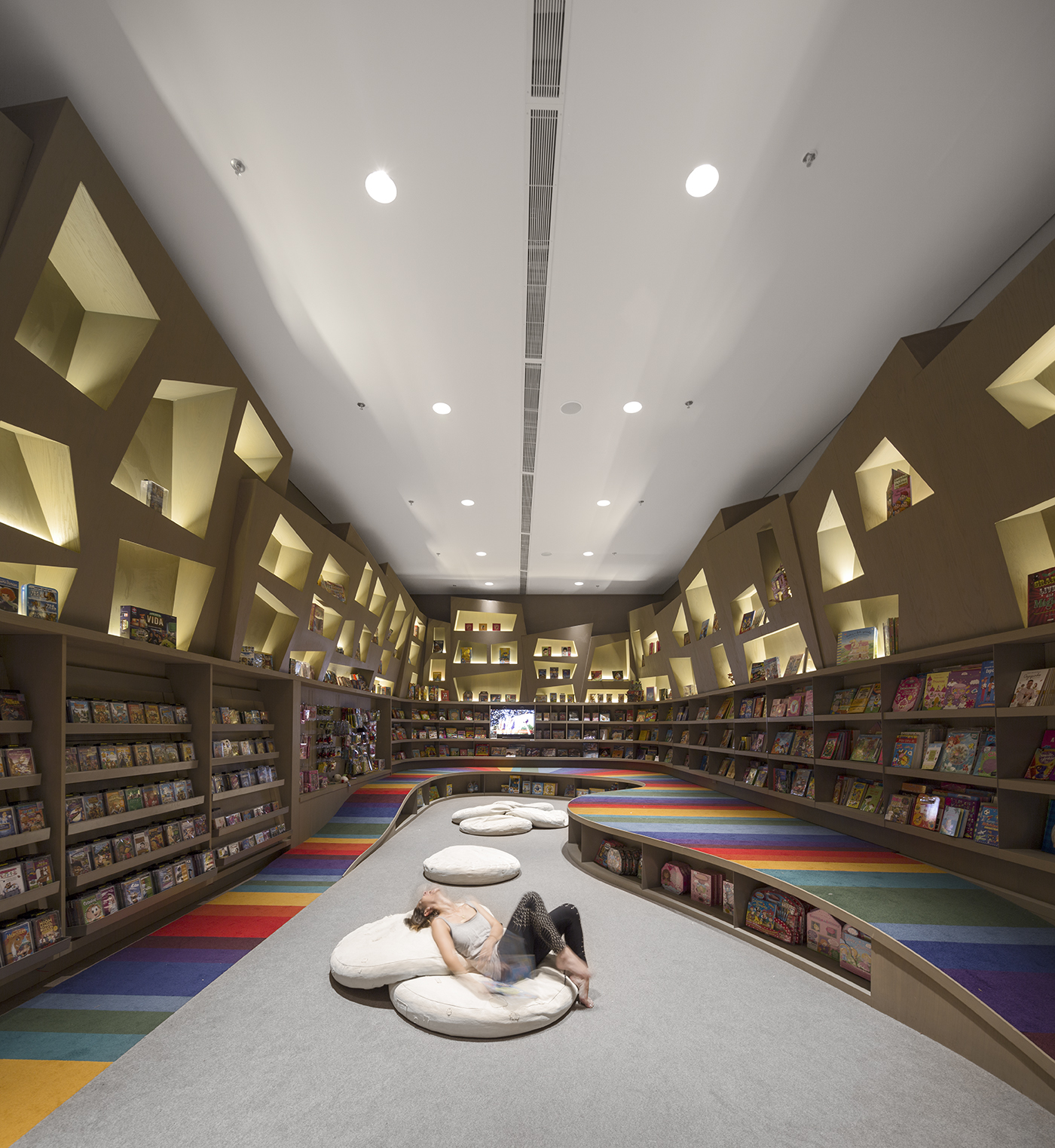
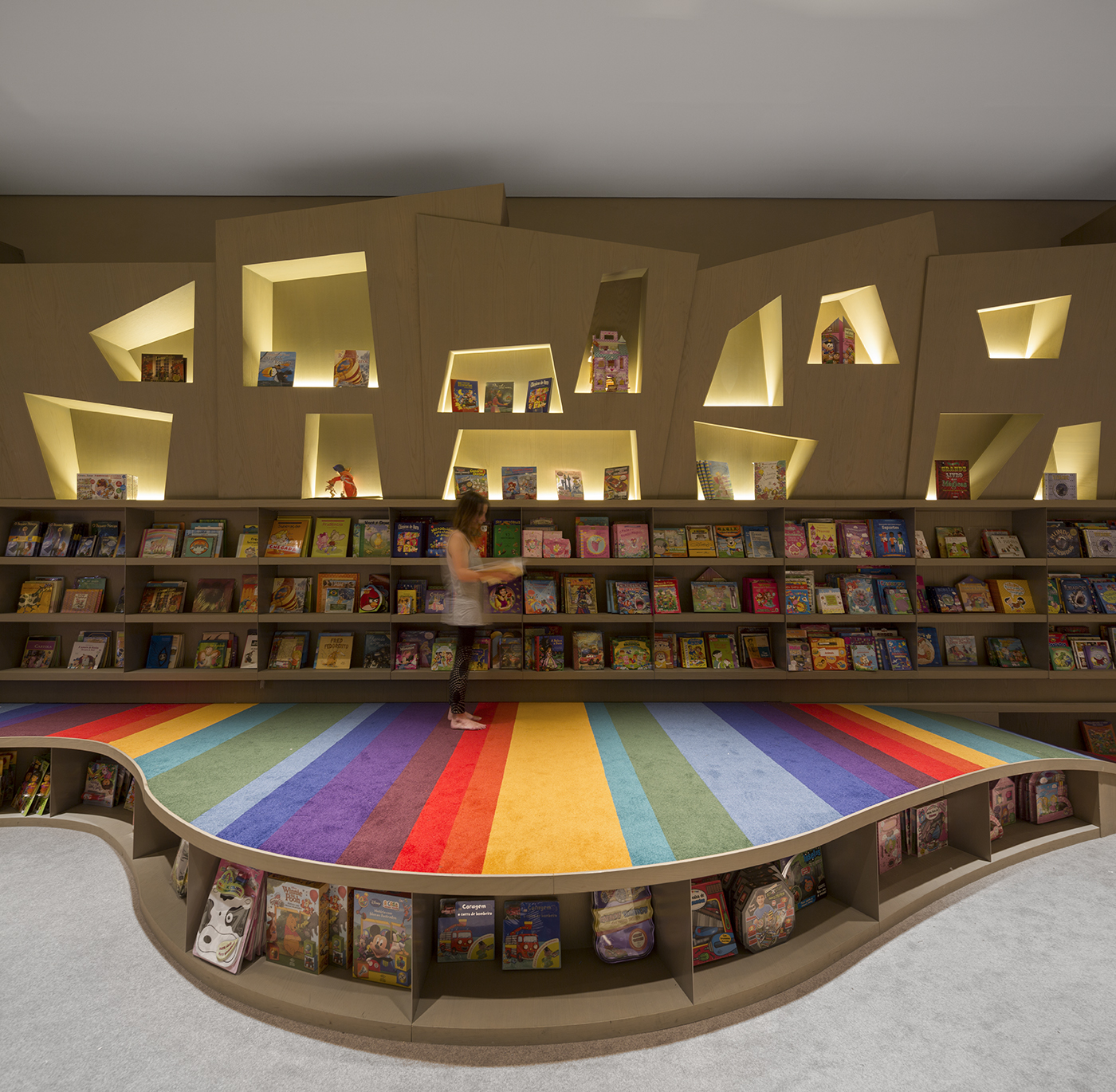
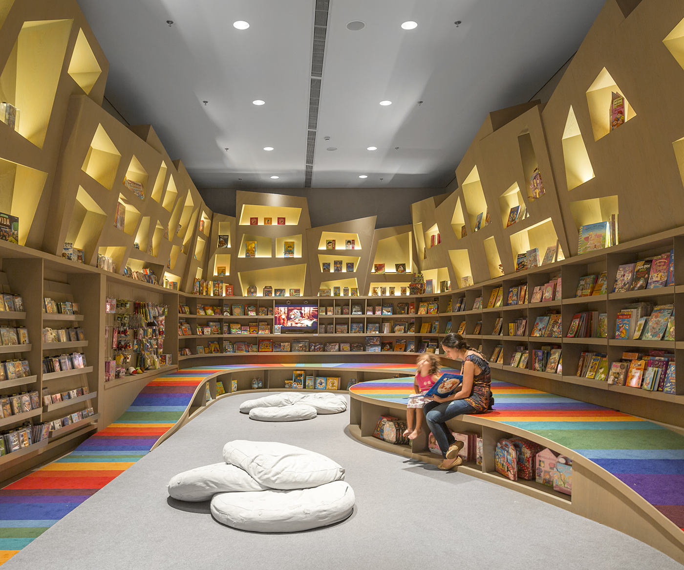
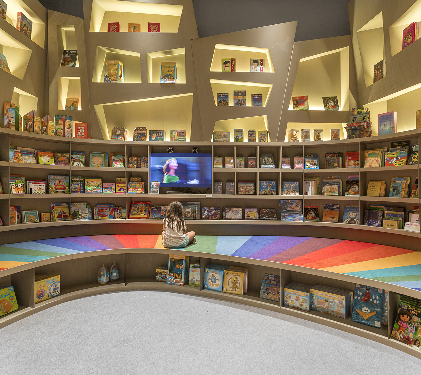
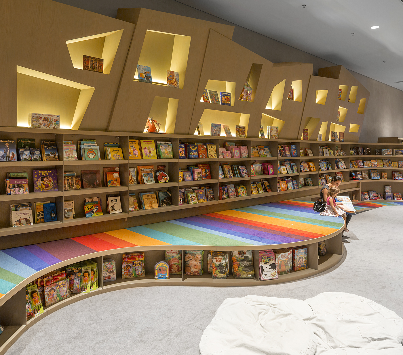
Initially encountering the children’s section elicits the idea that it essentially recasts the basic design elements of Saraiva’s larger areas with an imaginative conceptualization worthy of theme park proportions–Disneyland comes to mind. There’s a curious paradox to the color spectrum Casas employs in the children’s section, which is that “vibrancy” is an adequate term to describe the use of color as a design component, but the permeating, ethereal attributes attached to that adjective aren’t necessarily existent. Indeed, the only real locus of vibrant colors (not counting the glorious book covers) is the rainbow pathway–part ramp, part platform–circumnavigating the room. The choice to focus the biggest and brightest use of color on this single element is tremendously effective: it presents children with a robust spectacle without overwhelming them with too many perceptual complexities. In the same way, isolating the rainbow colors from the rest of the room ironically undermines children’s propensity to become easily bored, for it straightforwardly offers them an alternative object to focus their attention on should another element of the room become a bit drab.
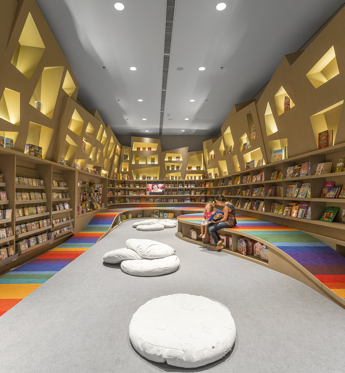
The rainbow ramp is of course practically applied to the layout of the room as well, providing easy access to hard to reach books, and a quick seat should any single volume grab the child’s attention to the point that divulging its contents becomes immediately crucial. Nevertheless, adult supervision might still be required to access the hard-to-reach books showcased in the rhomboid woodwork hovering above the wall of bookcases. The alcoves inserted into this woodwork constitute another interesting element of Casas’ design. Halogen lamps and cathode strips illuminate these oblique rhomboid recesses with a spotlight effect. The illumination of these recessed alcoves, their unequal distribution throughout the woodwork, and their non-parallel relation to each other, give them a spectral pattern of randomness that translates into a “floating” effect. On one hand, the alcoves thrust Lewis Carroll paradynamics into Art Deco theatrics–but on a more humble level, they are a surefire method to capture the gaze of children who are able to divert their eyes upward, away from the rainbow ramp.
With great effect and great purpose, the children’s section is truly meant to magnify and pronounce certain features guaranteed to bring feelings of vibrancy, energy, and enticement to young readers searching for inspiration within a book’s pages. The effect extends from the rainbow path to to the floating alcoves, and ultimately ends at a ceiling whose bareness and stark, industrial gray compounds upon the idea that the children’s section is an isolated world simulating a childhood wonderland, with all the concomitant inspiration and magic. Adults may laud Arthur Casas for his magnificently contrived bookstore design, but the designer himself has included a place for children–who are often (and rightfully) impermeable to the architectural points and details their older peers can discuss for hours on end–to themselves spend hours in without falling prey to the lurking face of boredom that we are so susceptible to at that age.
Photography by FG+SG Fotografia de Arquitectura
You might also like:


