Ornaments of Afghanistan: Adelaide’s Parwana Kutchi Deli
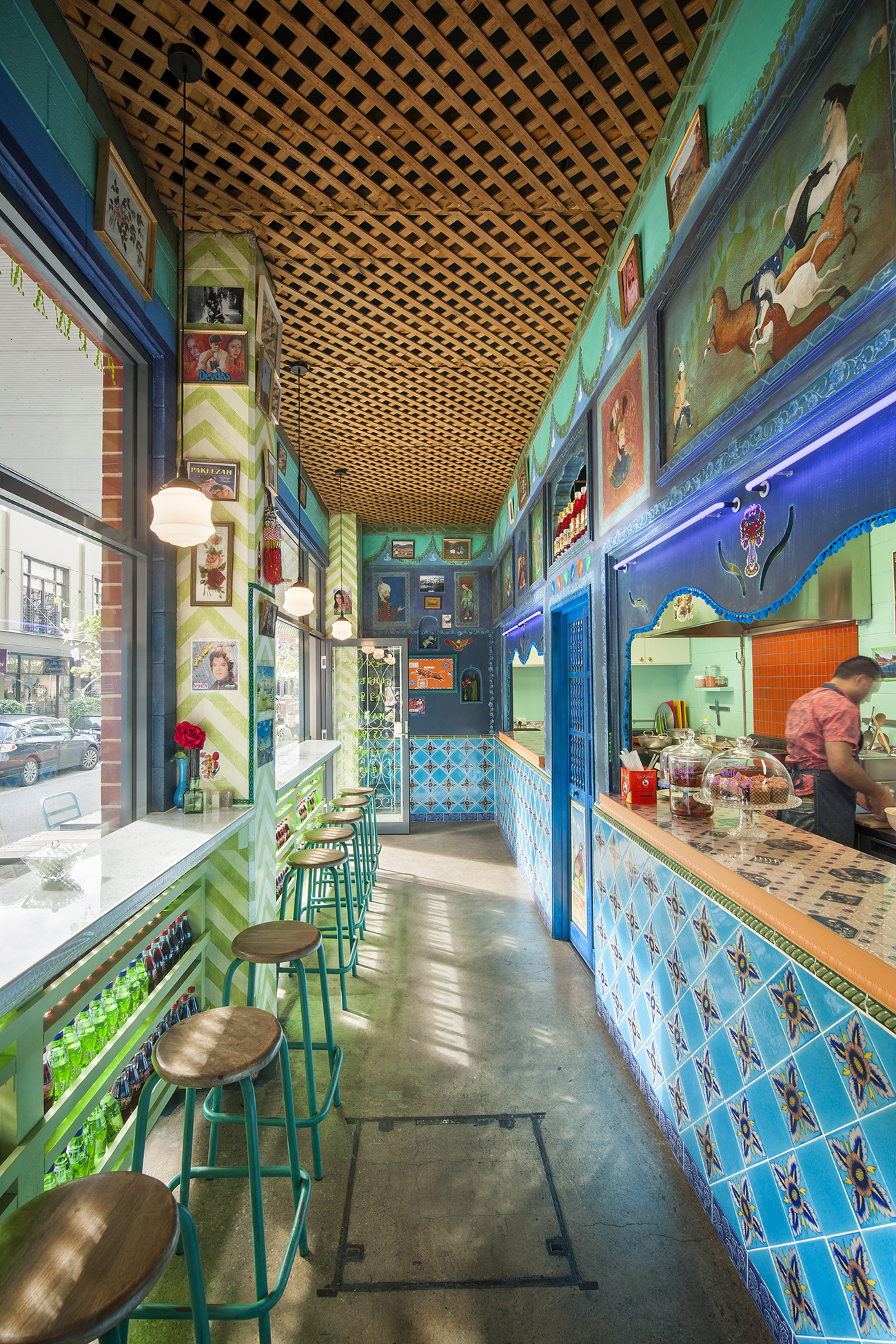
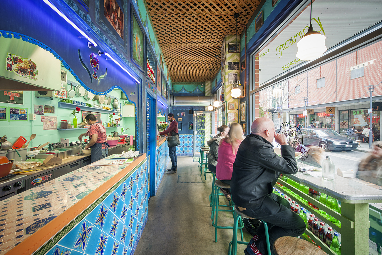
/“Creating experiences, as familiar as they are surprising,” seems a worthy impetus for the eccentric, but rich design of the new Parwana Kutchi Deli. Born of a collaboration between Adelaide’s Studio-Gram and Mash, the deli revels in shades of blue, referencing not only the richness of Afghani food, the architect describes, but showcasing an interior façade drawn from “the backstreets of Afghanistan.”
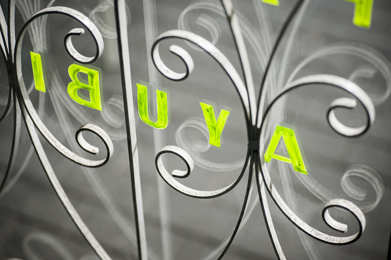
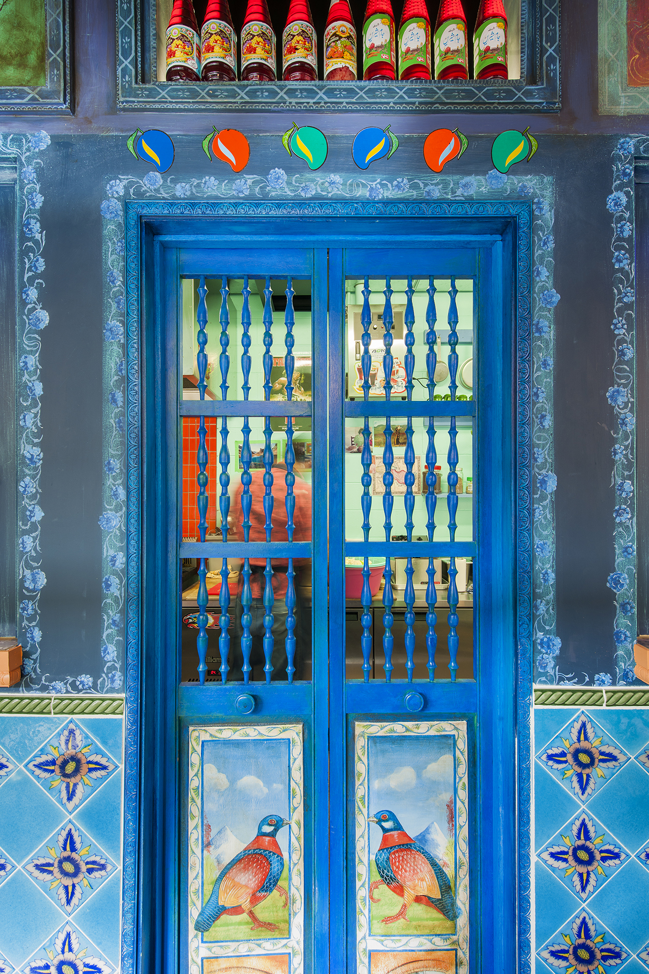
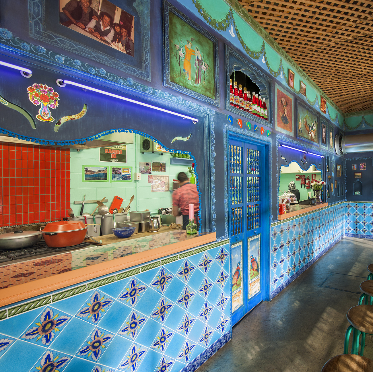
The deli - with a richness unanticipated by its name - comes from the Ayubi family. Zelmai and Farida Ayubi migrated from Afghanistan to Adelaide, Australia in 1987. They later developed parent restaurant Parwana so as to share the richness of Afghani flavors as well as the beauty of its dishes. The blue which permeates the space - azure dancing along outlines of a deeper midnight hue - speaks of Afghani culture. Much of Afghanistan’s traditional architecture is colored a deep Lapis Lazuli, the very blue mineral which served as Cleopatra’s eyeshadow in the ancient world, and is still primarily mined in the Middle Eastern country. Blue is peaceful, soothing to the eyes, and brilliant in its deeper hues of ultramarine. The space moreover is filled with ornamentation, mirroring the jewel-like intricacy of Afghani dishes.
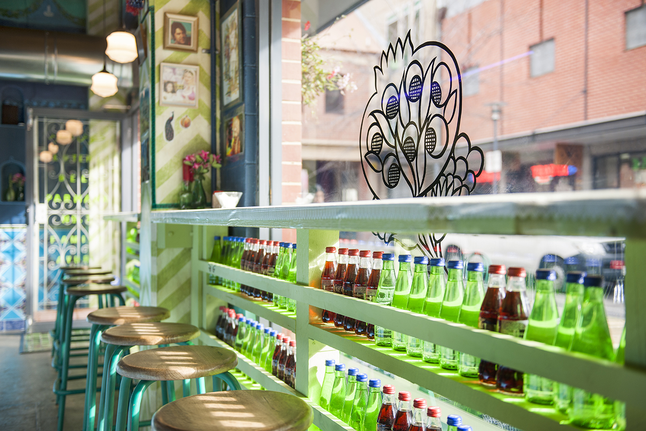
Murals, odd art, latticed wood, and starred tiles compose the restaurant, a tight space of 45 m2. Architect Graham Charbonneau of Studio-Gram approached the issue of division of space by creating “an internal façade, to mask the kitchen, [and] drive a line of separation between patron and chef.” Here, rows of stools line up along an eating counter, like seats in a soda shop, looking out on Adelaide through a peacock-emblazoned glass. The space is decorated with icons of Afghanistan, many brought back by the owners with others collected by the architect and a team of artists to contribute “layers of age, adding local craft to the setting.” This effect is important to the design, where “layers are added and removed . . . and nothing is as expected.” Traditional images of peacocks and alcoves of glass-and-silver lanterns mingle with fresh murals, starfish motifs, and glamor shots of Bollywood actors. “The result is one of wonder,” says Charbonneau, describing the schema as a journey of uncovering layers with each visit, and “embracing some of the things that don’t belong.”
It seems an appropriate enough philosophy for a collaboration between Adelaide-based design firms Studio-Gram, and Mash, who provided artistic direction for the project. The influences may vary for the two firms, but in the confluence of bright hues and wacky ornamentation, it’s still clear that Mash’s ethos - “artistry is paramount” - holds true. But this of course is with a touch of cheeky fun, as you might find when certain layers of the design are “peeled away.” It all plays into creating a center of community, a cozy space in which smells and conversation waft and blend in the air. Charbonneau describes that “the first time you are lucky enough to taste the flavours of Afghanistan, you will always be longing for more.” And what more could you ask from a restaurant than to inspire a place of comfort, a space that continually draws you back?
Lead Architect: Studio-Gram // Art Direction: Mash // Photography: David Sievers @david_sievers_photography

