Cool Classicism: Richard James Flagship on Savile Row
/Snapshot: Between the cool classicism of Savile Row tailoring and the quirky attitude of Richard James, Andy Martin Architects’ design of the eponymous flagship store has won for the prestigious International Property Awards.
“Style is the language of architecture,” writes architectural critic Witold Rybczynski in his treatise The Look of Architecture, in which he ties the two into an inseparable relationship. Like fashion designers, the best architects do not merely create a functional product, using a textile or wood to serve a specific purpose, but rather use details like a showman. They relish in the subtle flourishes, the not-quite-typical designs which are there for those who look closely enough. Perhaps this is why the collaboration between Richard James of the eminent Savile Row and Andy Martin Architects brought home the International Property Award for best UK retail project of 2014.
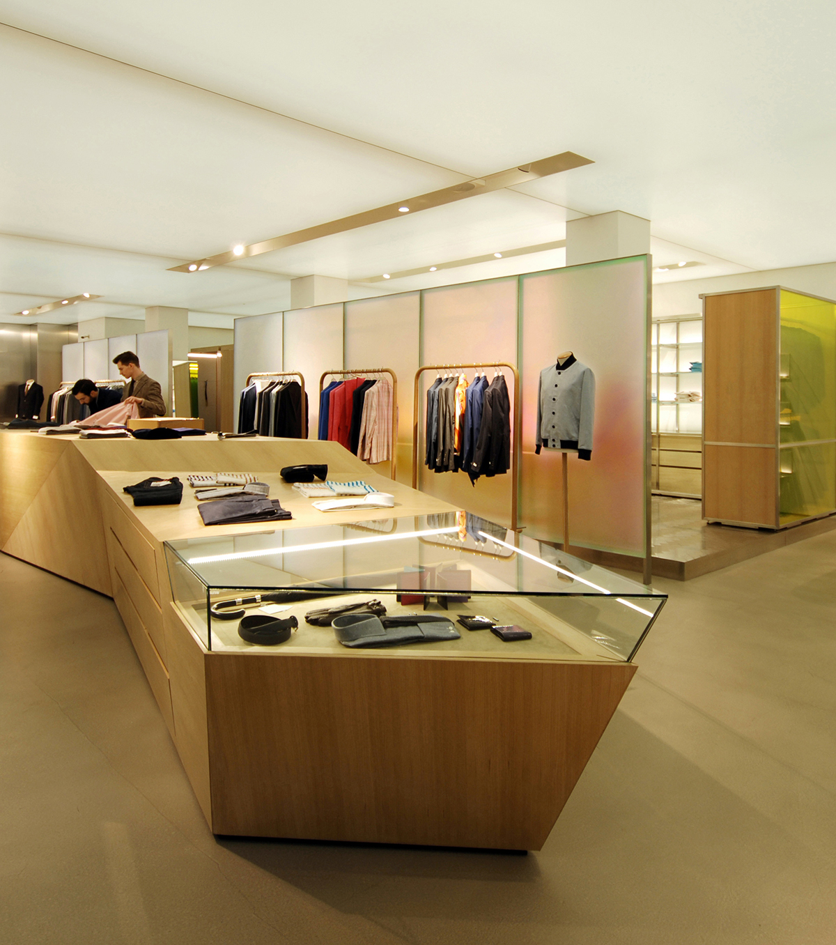
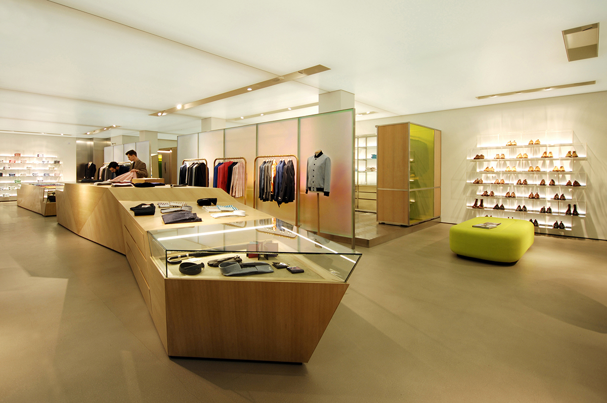
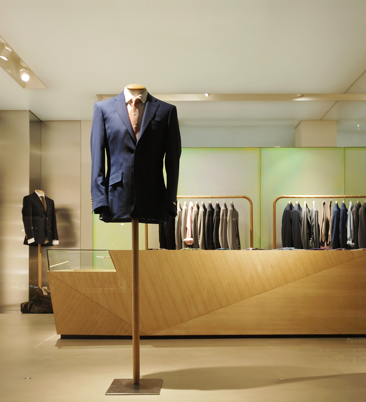
The store is marked first by its open, light atmosphere. Two sections of the retail space are separated by an opaque partition - unmoving but effective as a screen. It separates the “classic” from the “seasonal” section, yet still provides room above and to the sides for movement and air flow. Linking both spaces with a soft presence is the stretched canvas ceiling, a pale texture backed by ambient lighting.
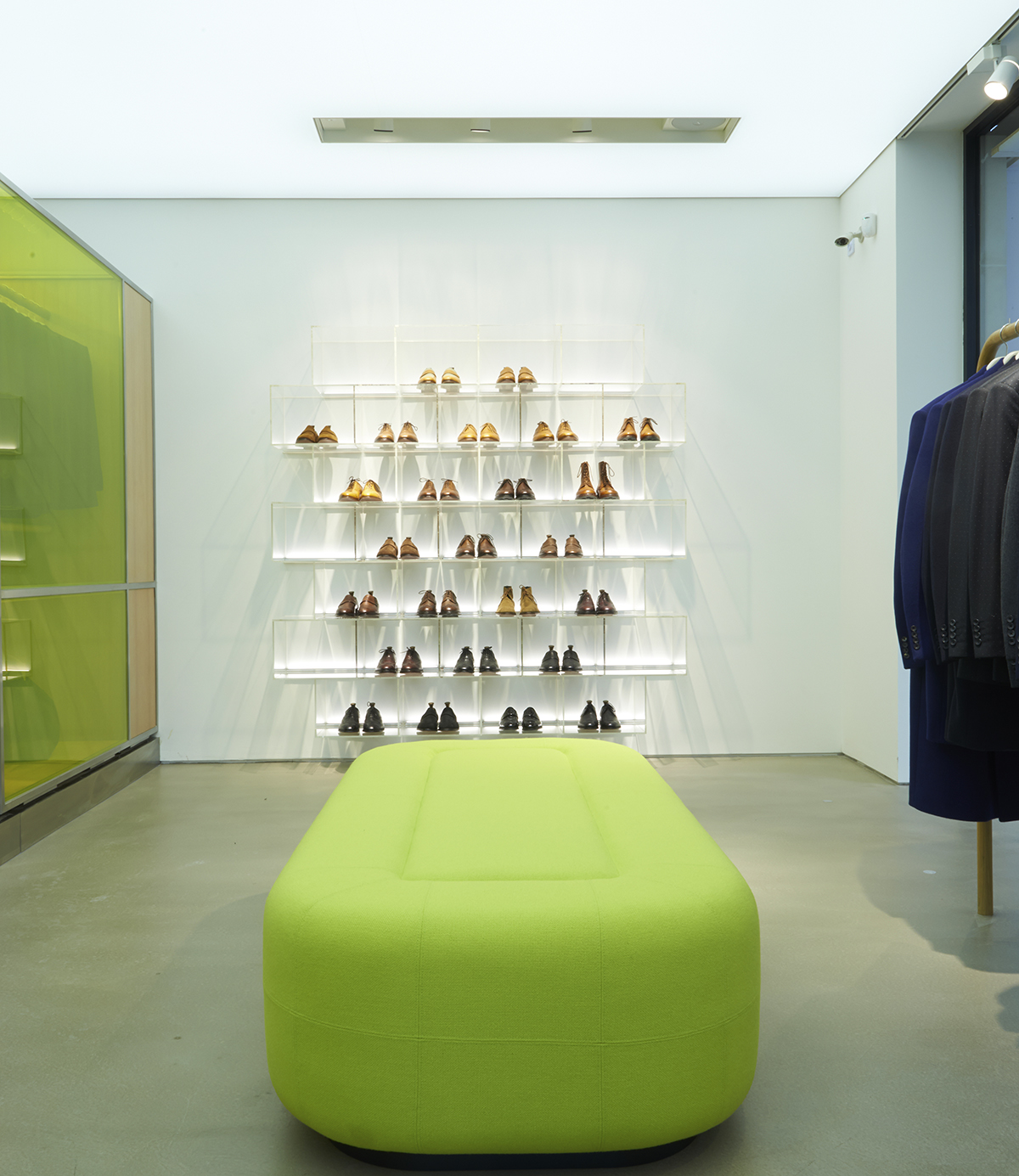
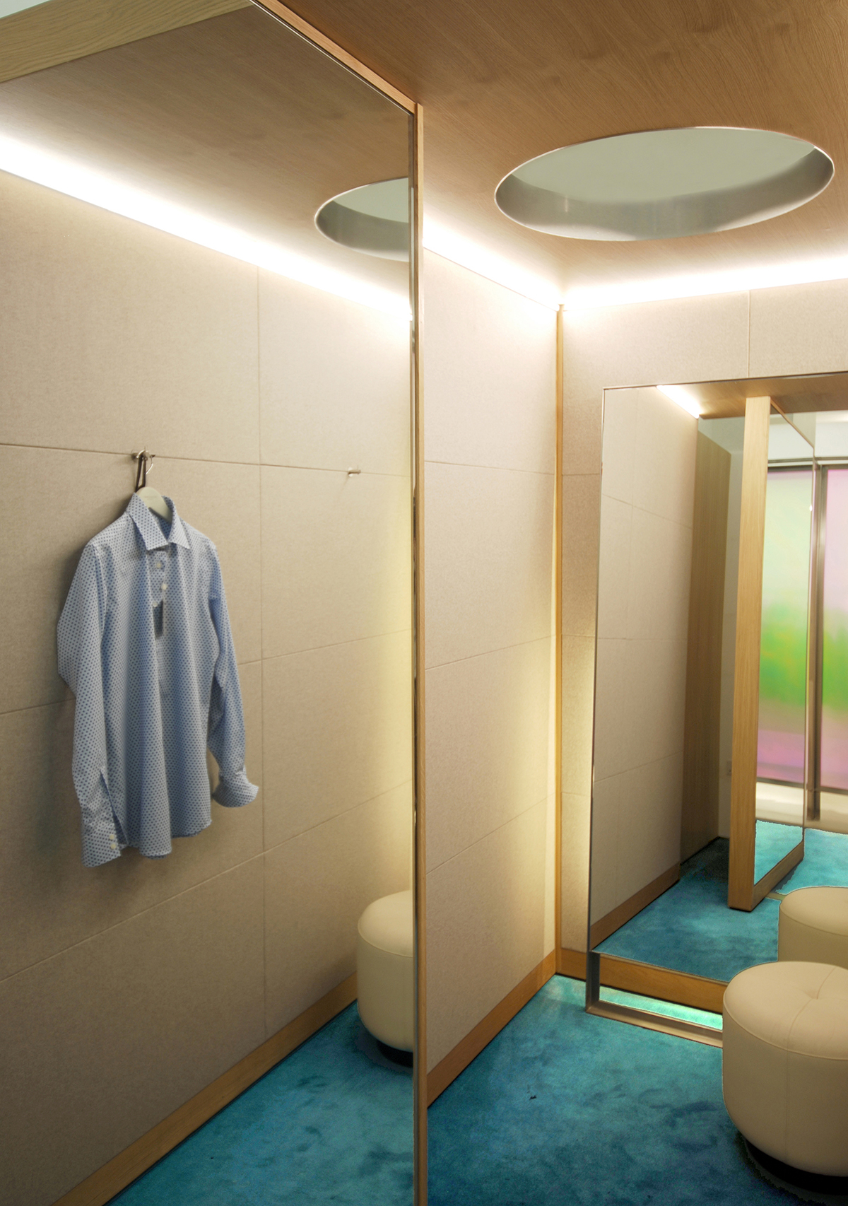
Richard James is a brand known for cutting a clean silhouette, while not being afraid to pop out with some rich color. Architect Andy Martin took to studying the Richard James philosophy to guide his design of the London flagship store. Color becomes a subtle, yet subversive presence amidst the natural wood furniture and classic cut suits. A wall display of shoes is organized by shade - coppers and camels float to the top while darker leathers hold close to the ground. There is the cadillac blue and the bold plaid overcoats of James’ Fall/Winter 2014 collection, but this is no smoky 50s jet-setter's lounge.
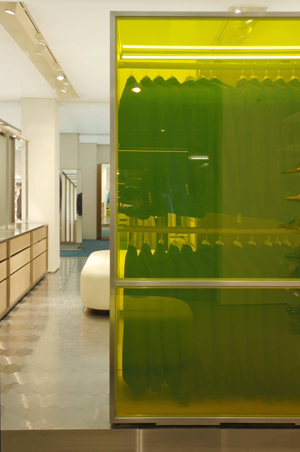
It’s a modern redux, evidenced in a two-tier suit rack seen through an electric yellow partition, or a luxurious suit in textured ecru displayed against a harlequin green wall. And that partition which divides the space? It is projected with dichroic film, a color filter which allows through only a small range of hues. Yet the light here emanates a smooth backdrop, a subtlety against the expert handicraft of the products displayed. This is Savile row, after all.
As for the International Property awards; the panel consisted of more than 70 experts, amongst whom were active members of the House of Lords - this is no junior accolade. Once you get past the strict entry process and the prodigious field of competitors, it comes down to the judges. The total of all the judges’ scores are calculated as a percentage, and the highest percentage category-wise brings a prize. But don’t leave this architecture experience, which celebrates such fine tailoring, to the experts. Visit the Savile Row and judge for yourself!
Photography courtesy of Andy Martin Architects
