Alphabetical Shapeshifting: Mary Katrantzou’s A To Z Collection
/Snapshot: Mary Katrantzou’s A To Z Collection curates the work of established and emerging artists with colorful and perceptive variations, and sits alongside her line of printed womenswear on the ArtStack Platform.
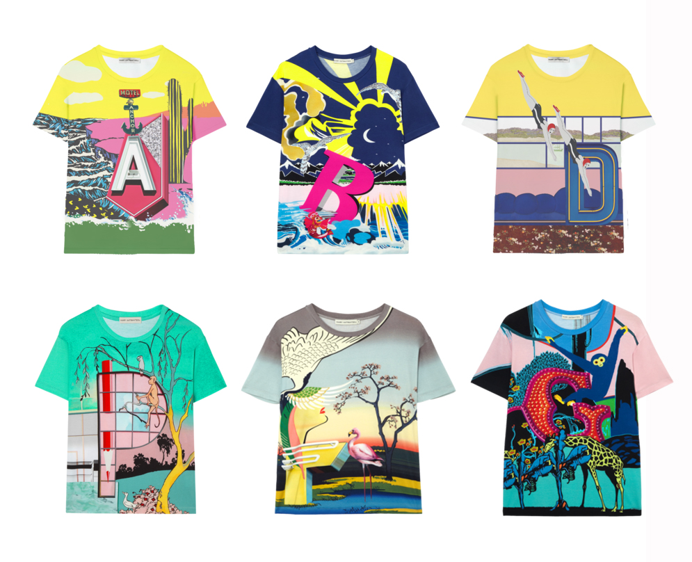
The beauty of Mary Katrantzou’s sweaters and t-shirts is not simply a result of their artistry, but of their being actual works of art that have been printed onto the fabric, and “A To Z” is the line’s companion Collection, a set of 26 conceptual variations on different artists’ works, each of which centers upon a letter of the Alphabet. Like her womenswear, which experiments with the way in which art can change the shape of woman’s figure, the Athens-born American designer’s A To Z Collection changes the shapes of existing works of art through large-scale, epic variations. The ArtStack platform will feature both of the A To Z Collection and the womenswear as companion pieces, the clothing articles being fluid, fashionistic extrapolations of gorgeous digitized prints, and the A To Z Collection it’s luminously paradisiacal and surreally vibrant sister.
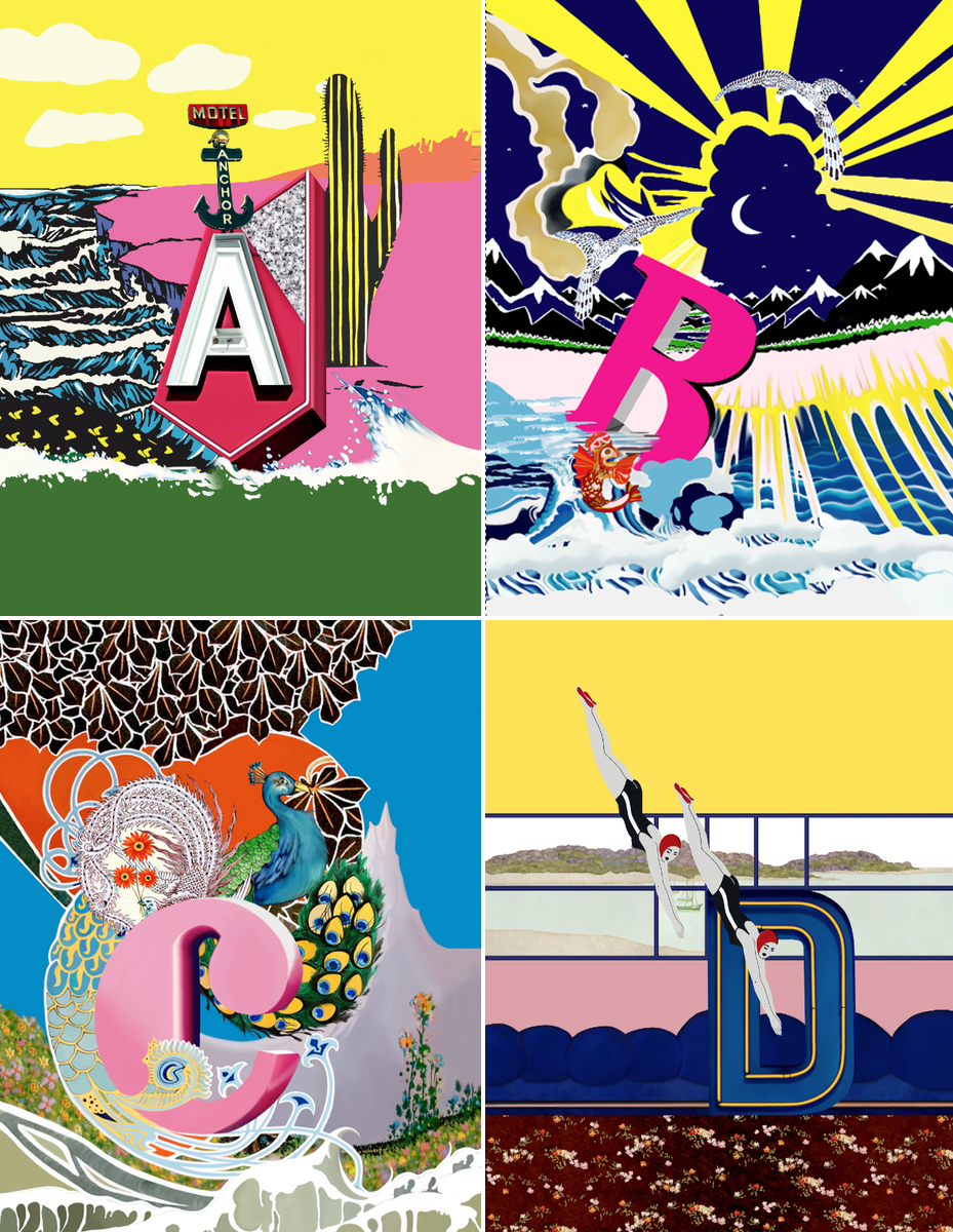
The basic concept of A To Z lies in re-rendering existing works into an artistic variation that incorporates one of the 26 letters, with a phonetic similarity between letter and subject. “A” is an appropriation of Tristam Hillier’s “Variation on the Form of an Anchor,” and sees an obliquely offset “Motel Anchor” sign topping off the “A” on a 3D set-piece affixed upon a colorful backdrop. The original work by Hillier was a surrealist impression of an anchor with a dimensional and vertical depth, lying against a calm ocean, and “A” in the A To Z collection is a surrealist interpretation of that surrealist interpretation that wouldn’t be out of place adorning the cover of a Pynchon novel, or an obscure metaphysical tract by some Argentinian or Italian philosopher.
In this way, A To Z variates the very notion of depth from both an artistic standpoint and a theoretical standpoint, curating established artistic heritages but giving them a postmodern redux with a positive touch located in the vibrant colors and the implied dimensional planes. Not all of the works in A To Z play with established artists like the 1930s Hilliers piece (which is itself a variation on concepts explored by an earlier Italian artist): some are from emerging modern artists as well. This is sure to add a huge amount of variety to the collection and to ArtStack in general, and such variety is already a stylistic feature of A To Z; letters A through E are roughly similar in their use of color and subjects while F is an Egyptian-phantasmagoric game changer.
There’s no dearth of eye catchers in the A To Z Collection: A is definitely for aesthetic, for artistic, and for appeal, when it comes to Mary Katrantzou’s ArtStack platform.


