Transmuting History: CrystalZoo's Extension of SEU University
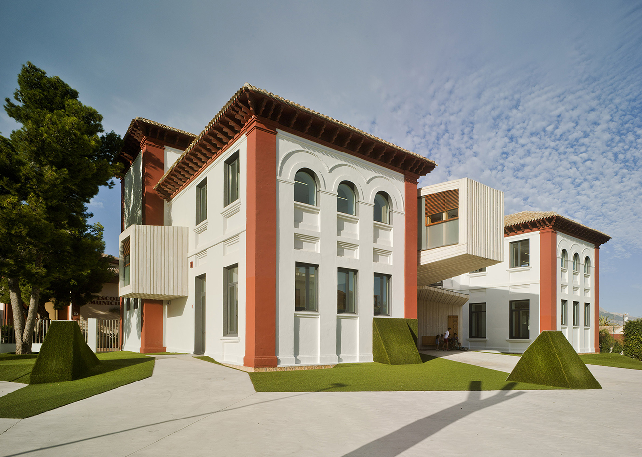
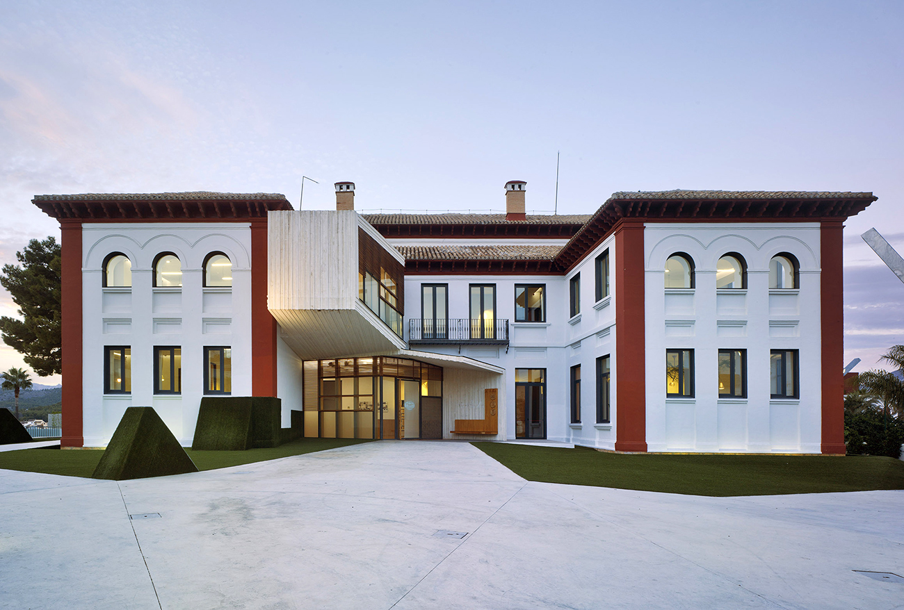
/Snapshot: La Nucia's University "La SEU" has been transformed into the modern age by Spanish architecure firm CrystalZoo. Retaining the structure's historical façade - with its colonial stucco and burnt red - the extension morphs the building now "wreathed on itself" and creates new, airy interior spaces where technology and conversation become cynosure within the space.
SEU University transforms its historical record before your very eyes. Sprouting out of the rich landscape of La Nucia, the building fruits itself in the variety of textures, forms, and the topology of space changing over time. La Nucia itself lies in the region of Valencia, Spain, surrounded by low, purpled mountains. It is within a fruit valley and even the name, La Nucia, derives from the arabic Nazina, for "delicious." Like a Valencian orange, the structure's historic exterior belies the clean, airy, and technologically-contemporary interior.
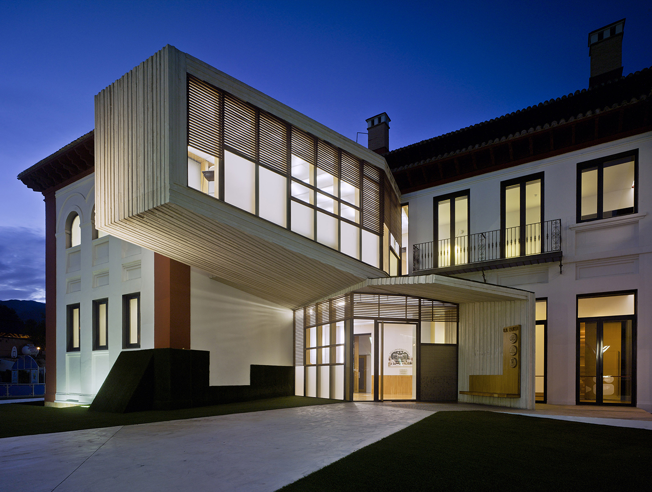
The structure pays homage to an eclectic past, where different languages and cultures formed a hybridized and global Spanish culture. Here, the original structure opens boldly to a a view of the Mediterranean, stalwart like the city of La Nucia upon a forested hill. Windows' square bottoms curve up in sensual arches, directly reflecting a Moorish influence. The red bastions of each of the building's corners, and the tall white walls reflect the white-and-crimson marble of Renaissance Italy without the pomp and ornament. It is more like a Spanish fort, remnant of the days of colonial conquest when globalization became a norm, mixing language, culture, and ideas. Just so the building's extension serves this purpose: cubes are added on, jutting out from the front and side of the structure for additional education space. New channels of circulation allow the building to breathe and focus conversation and thought in a spiraling circumnavigation of the structure. The building too incorporates the grounds and landscape in typical CrystalZoo fashion. It is "a strategy of intervention in an environment which is already consolidated." Indeed, CrytalZoo's geometric green swards and sculpted "annexes" feel more like a whimsical landscape from Wonderland.
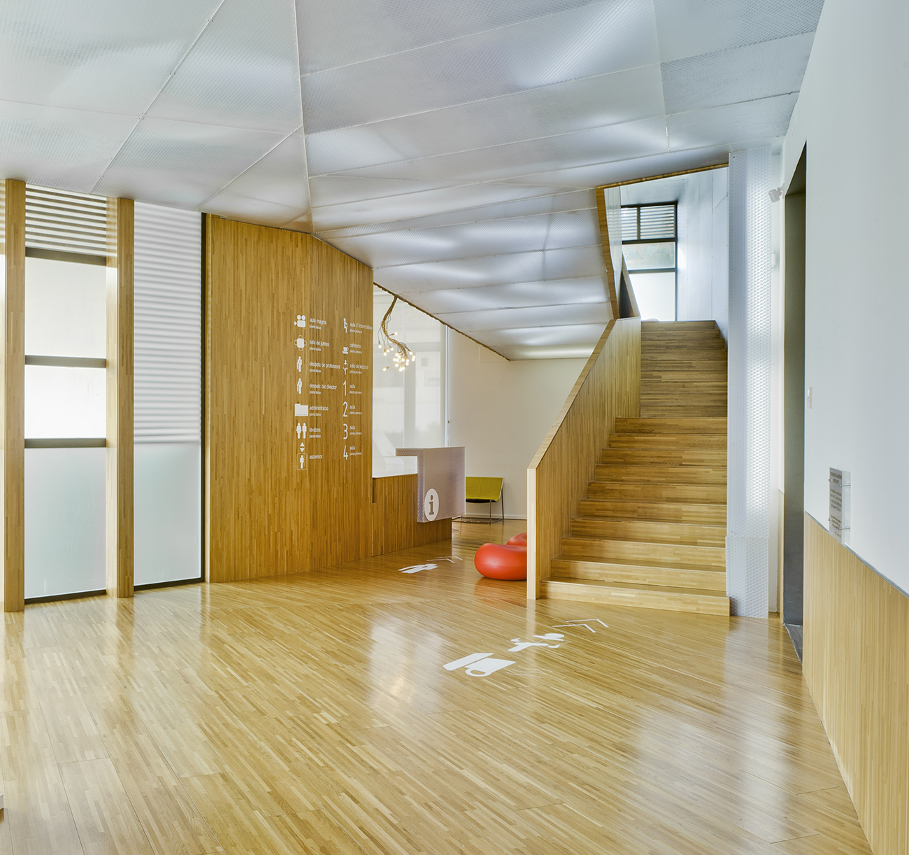
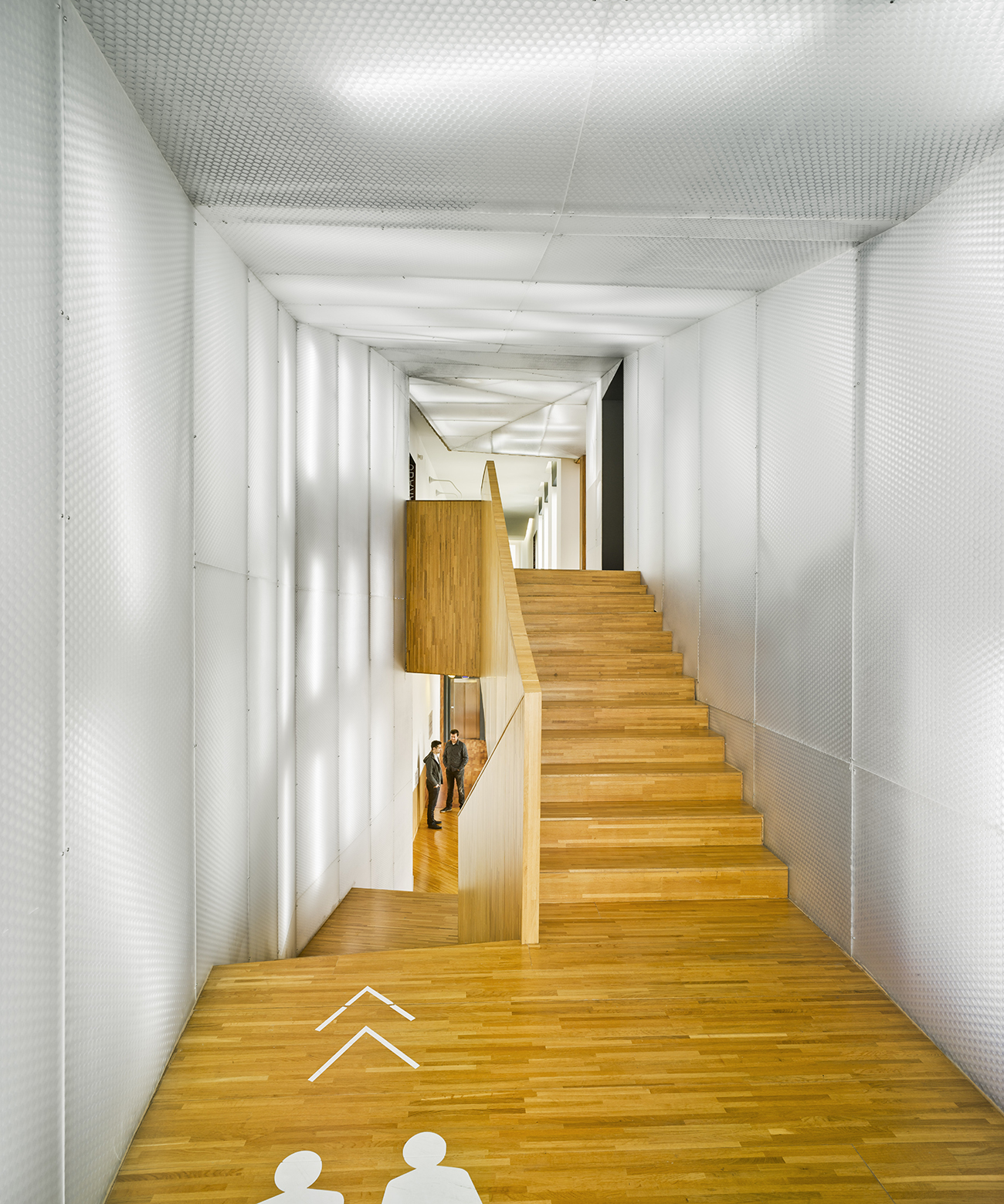
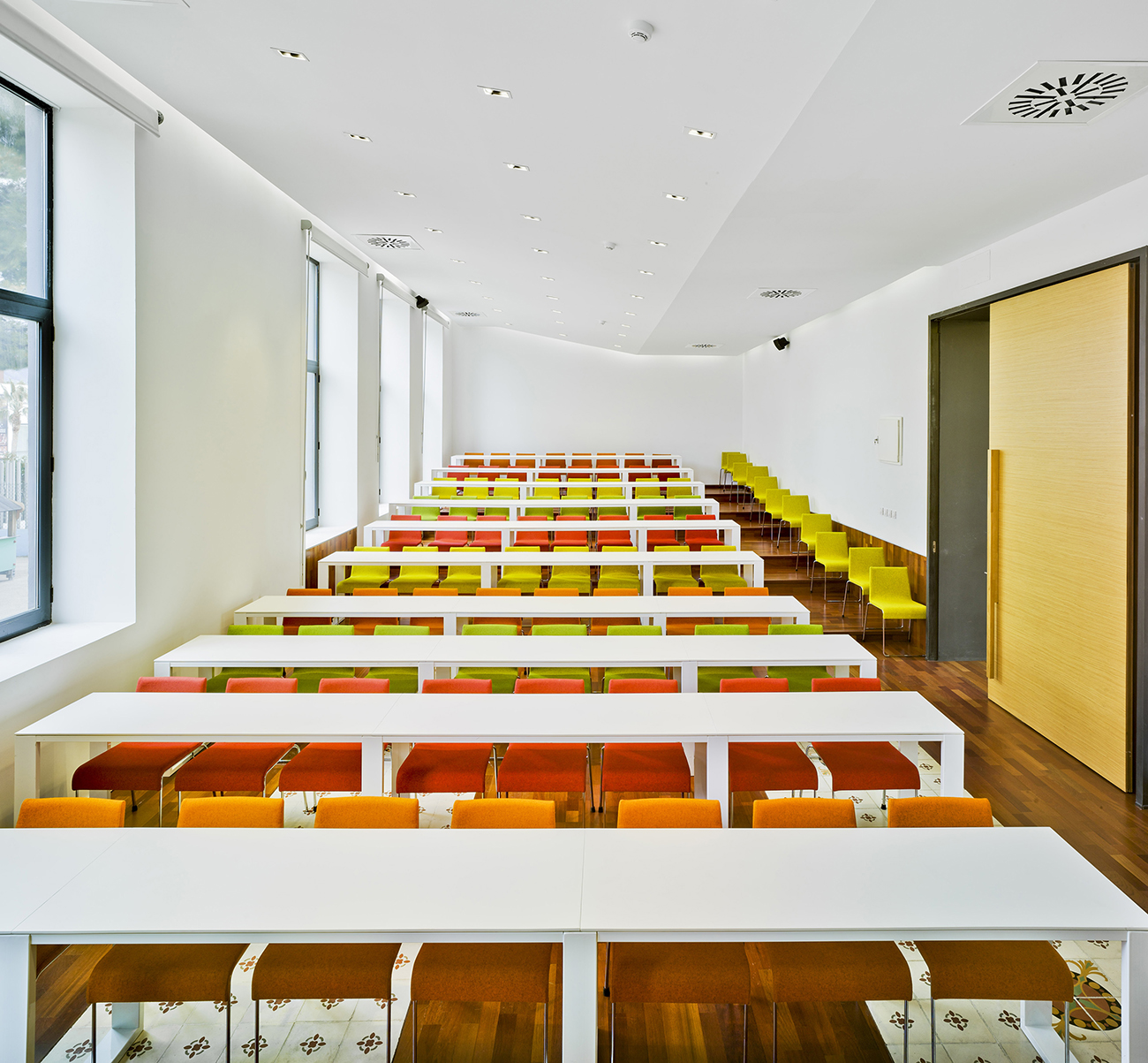
The interior channels a certain energy of collective memory: it is a memory of space as it shifts, speaking simultaneously in the past and present, referencing backwards while drawing its denizens forward. Cubic extensions appear thick-stacked like the vertical-turned pages of a book on the exterior; on the interior the walls gleam white to shift focus centripetally. Here the desks are a clean white sweep and chairs are simple fabrications of warm colors and metal. The parquetry of the floor establishes a subtle visual interest via the contrasting textures and tones of wood. The white walls draw attention to the student, he and she at the nucleus of the room, while thought and conversation flow centrifugally, enlivening the space.
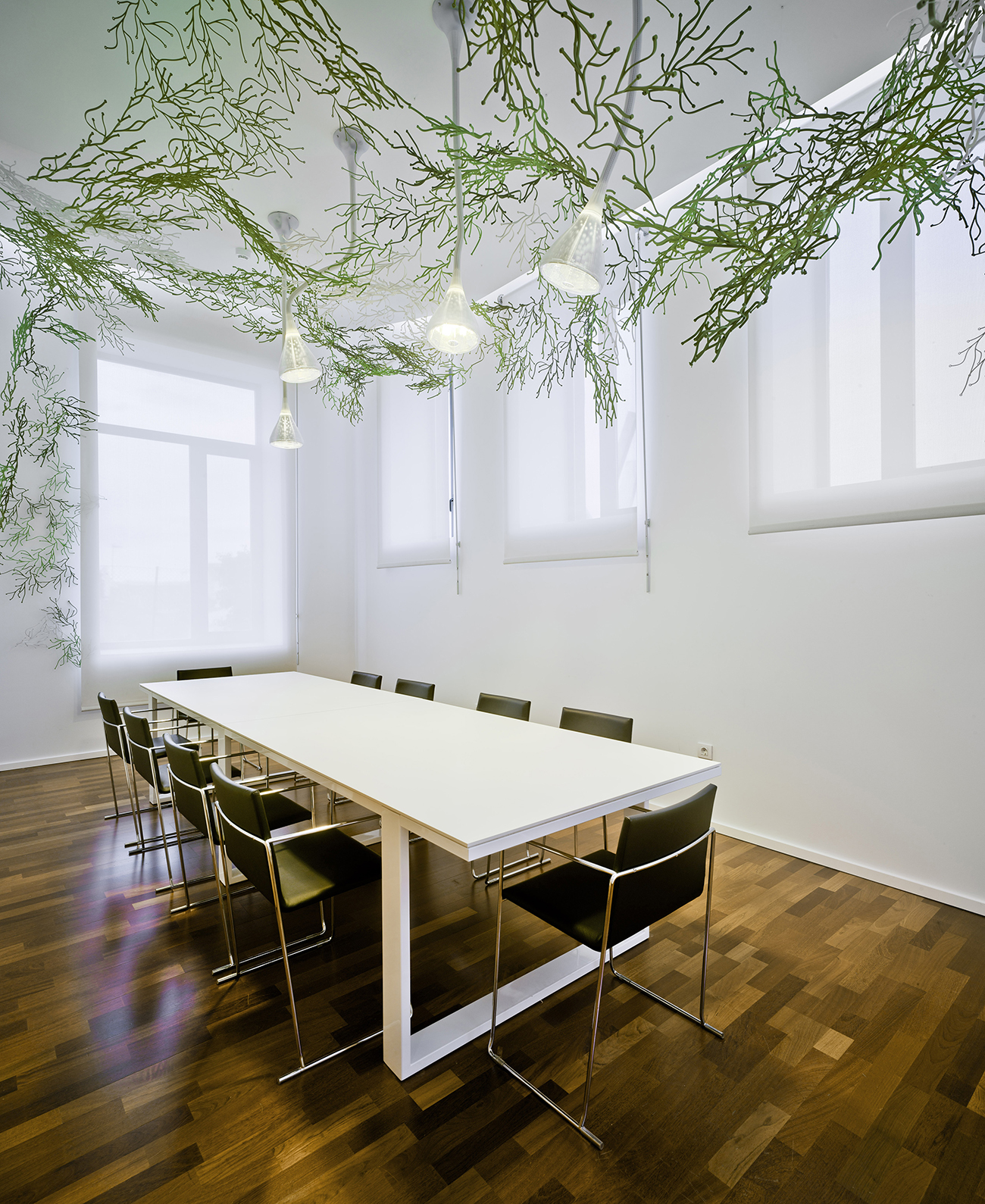
The exterior grounds reflect many of CrystalZoo's predilections; for one, the use of landscape to draw the viewer's eye inwards to the building. The structure, in turn, draws from the environment. The hues and textures in the dulled, earthy tones of the façade and the interior parquetry and wood detailing reflect the arboreal exterior. Finally, there is a sense of wonder, of humor in the grounds and interior. What happens when certain things are juxtaposed, the architects seem to inquire: historic arches with armlike steel sculptures, stark white interiors with ceiling-hung greenery, earthy architectural exterior with jutting modern cubes? The result is an experiment in social and historical exchange, "establishing a dialogue between each stage of its evolution" so as to prove to the world that architecture should not fade or die, but rather transform itself to the meet the needs of its time, and its occupants.
Photography by: David Frutos
