Defying Gravity: Toy Management House by Andrew Maynard Architects
/Challenging perceptions and answering prayers, Andrew Maynard Architects provide stylish solutions for when two becomes three.
Not knowing where to put a new baby and the excessive paraphernalia that comes with, a young couple came to AMA with the home they couldn’t bear to part with and a pretty important due date. With a stairwell that was literally illegally tight, a total lack of natural light and a labyrinth of dark, awkward or unused space, one wonders why they were so desperate to stay, let alone invite the baby. However, once AMA were finished with it, the “Toy Management House” became the real-estate pride and joy.
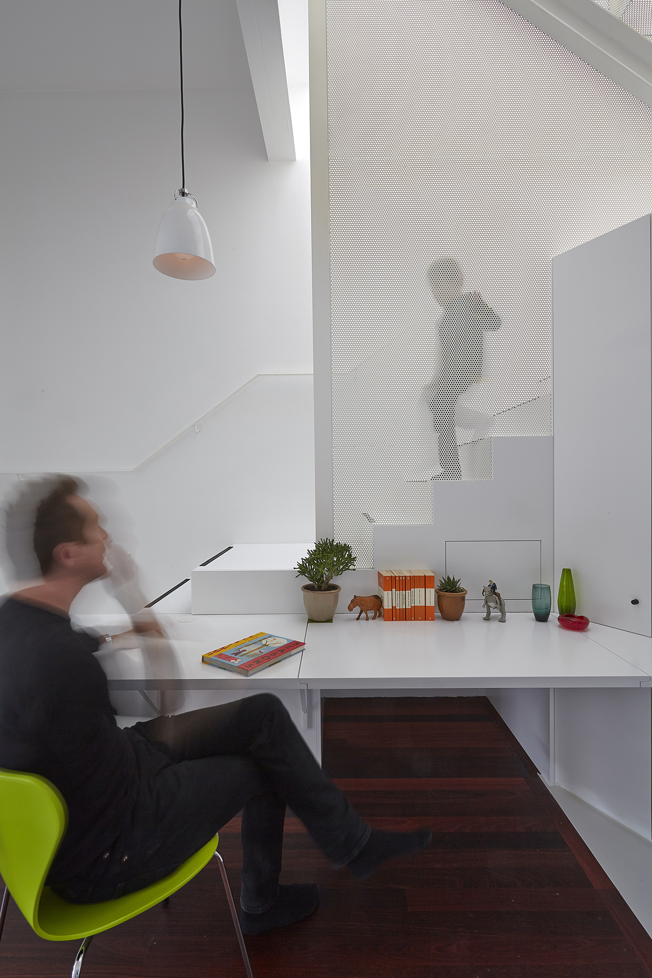
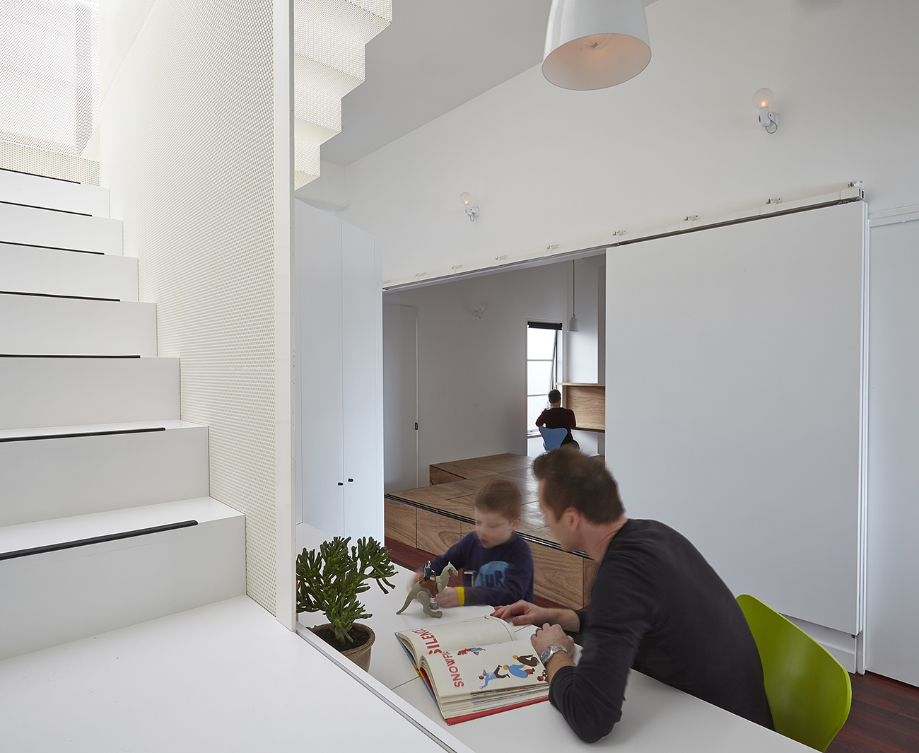
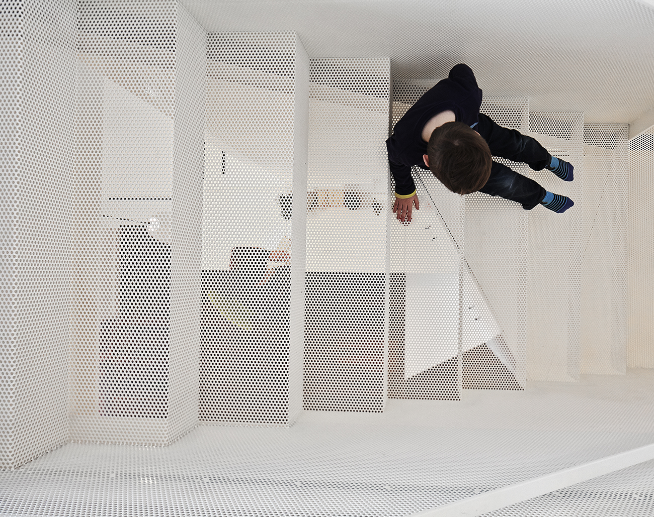
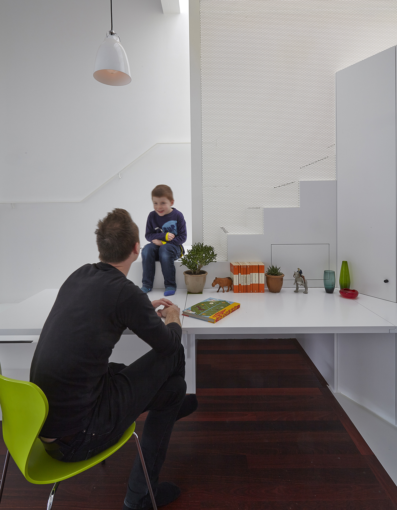
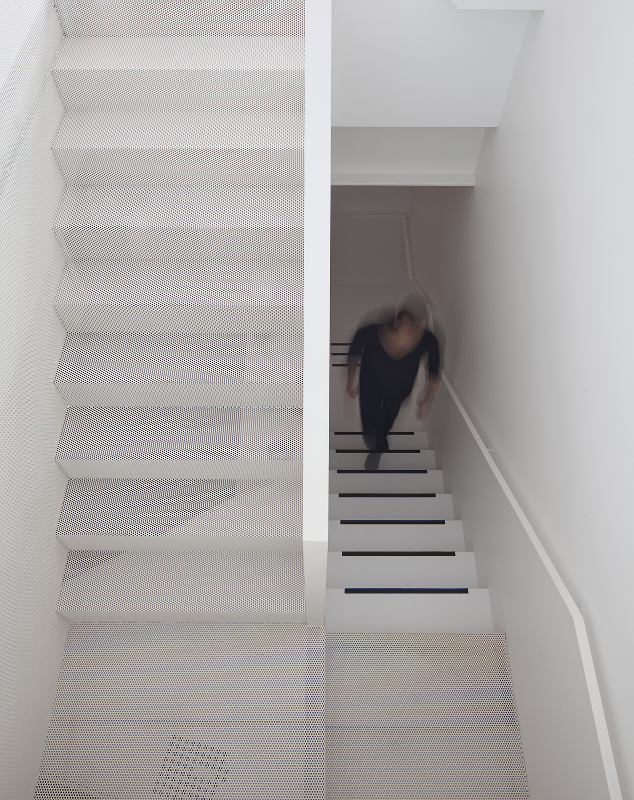
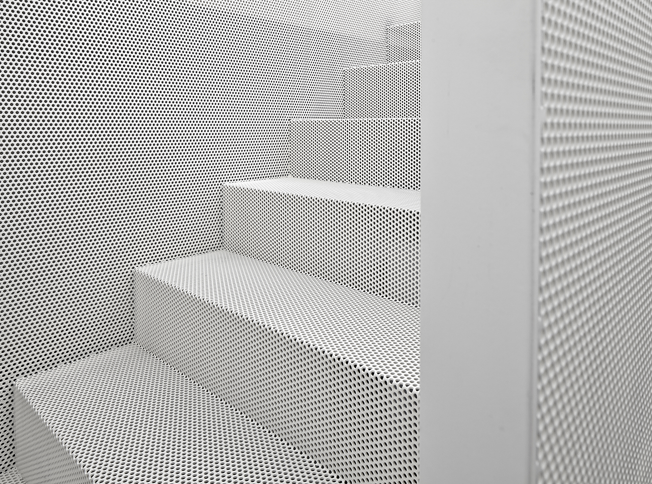
As a parent, Maynard cleverly tapped into his “hindsight” reserve and designed the house to aid parenthood with light, space and imaginative efficiency. Bright white walls – in fact, almost everything is white – with white mesh stairs open the house up and allow light to flow throughout. There is a dialogue created between the two levels, both in design and actual human communication, as the family can easily speak with each other from opposite ends of the house. There is even a winch for all the heavy lifting of cots, beds and whatever other furnishing changes the new addition will bring to the home as they grow up.
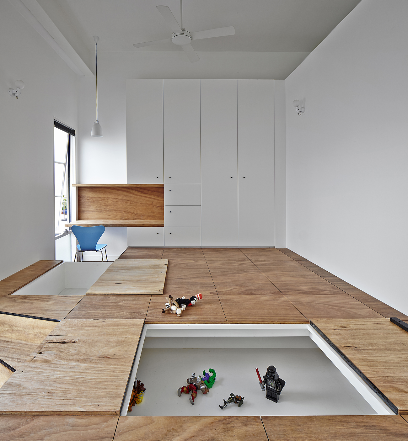
Doors and walls slide, vanish and reappear depending on the needs of the child; stairs fold, transform into a jungle gym, or gently wrap around the office space as a casual seating spot. Here is Papa’s vantage point, expertly designed as the center of the house so that he can keep his eyes on every corner that baby might try to hide in or escape to. The efficient use of space peaks in the child’s bedroom floor, seamlessly disguised as a toy box. Here is where the project earned its title and triumphed over children’s incessant need to drop things. With trap doors and hidey holes, the slightly raised floor acts as a “fun game” for the kids and a handy storage space for the millions of toys that will accumulate over the years. Genius. Not to mention the giant bathroom that was sliced in two with showers back to back to ease the plumbing headache and give everyone a little privacy. Simple.
When it all comes together, it seems so obvious that we wonder why everyone isn’t doing it. AMA have transformed the traditional “home” that can easily be destroyed by sticky fingers into some sort of Disney-Pixar wonderland that works like a dream for everyone in the family.
Photography by Fraser Marsden
