Spanish ‘Art’chitecture: Casal de la Juventud Youth Center by Crystalzoo
/Snapshot: Spanish architectural firm Crystalzoo, returns with Novelda, Spain’s Youth Center, an artistic urban structure that harmonizes culture, color, and a youthfully spirited creativity.
“Casal de la Juventud,” Crystalzoo’s new Youth Center project, is a new statement piece in the Mediterranean town of Novelda, Spain. Spanish architecture firm Crystalzoo’s lead architect Jose Luis Campos Rosique has helmed the realization of a building that dialogues about culture both past and present, with its context of old structures, urban scenery, and the identity of a Spanish city, and all in a colorful, transparent, at times primitive, way.
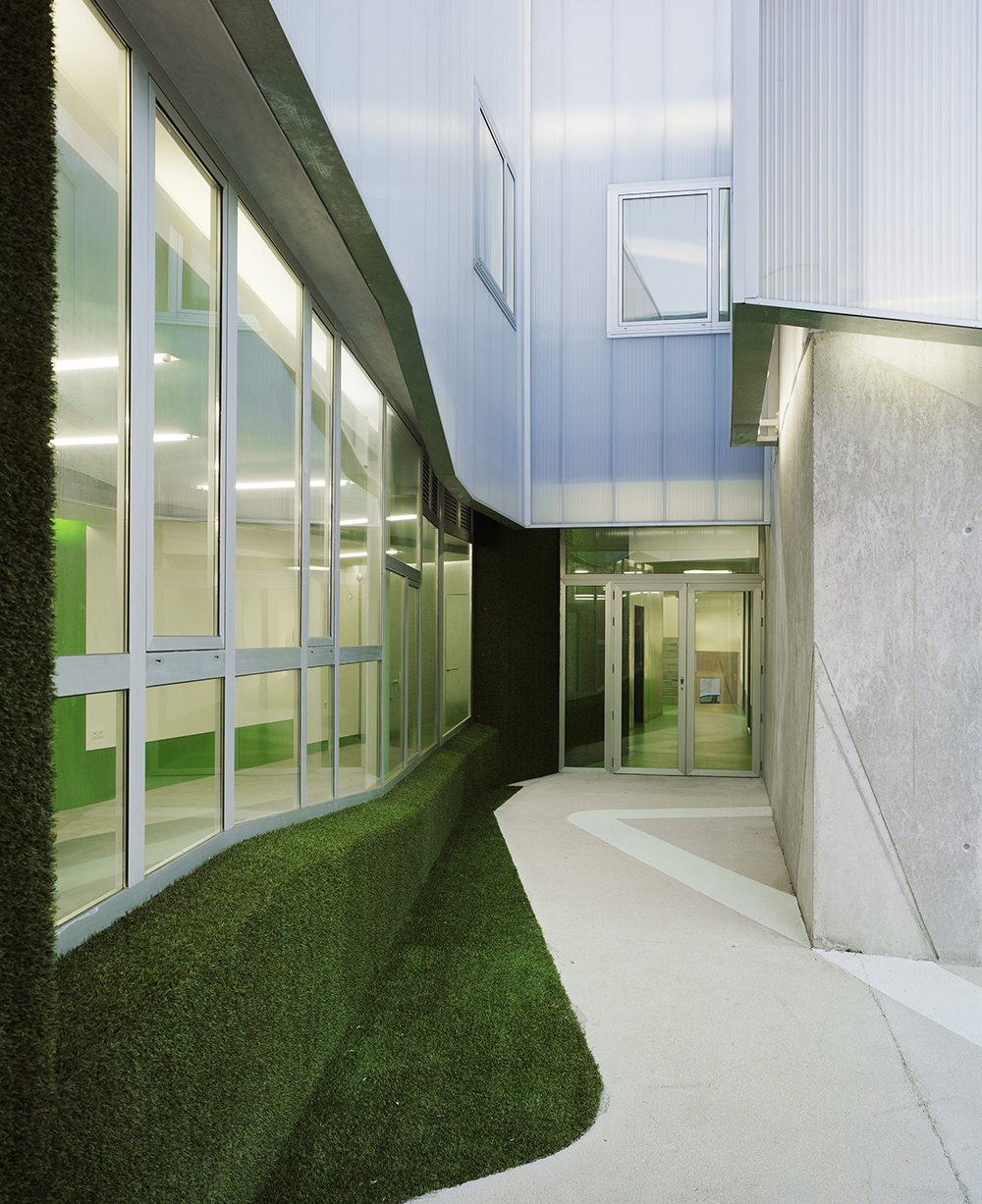
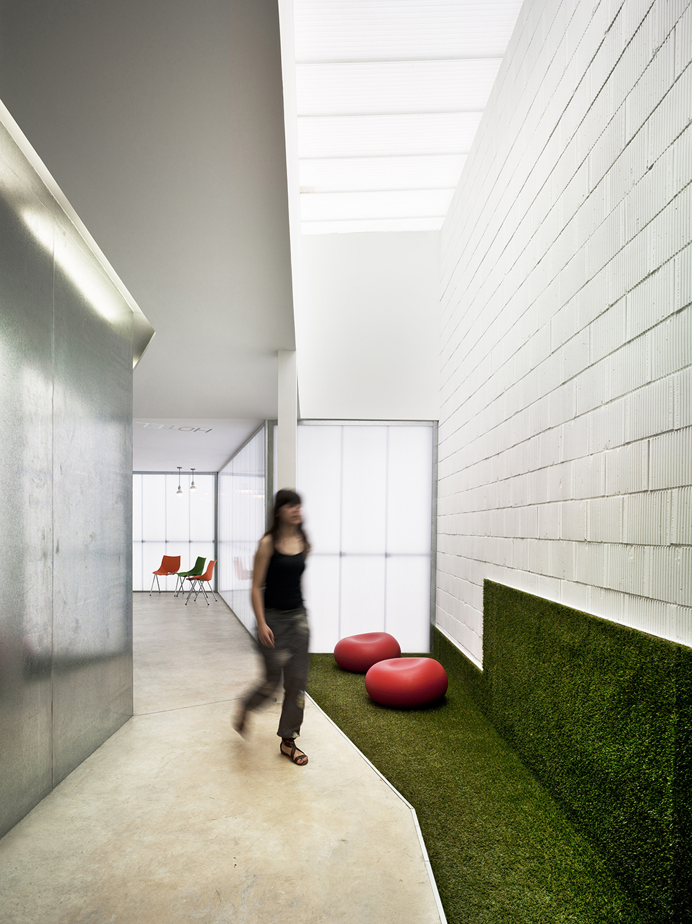
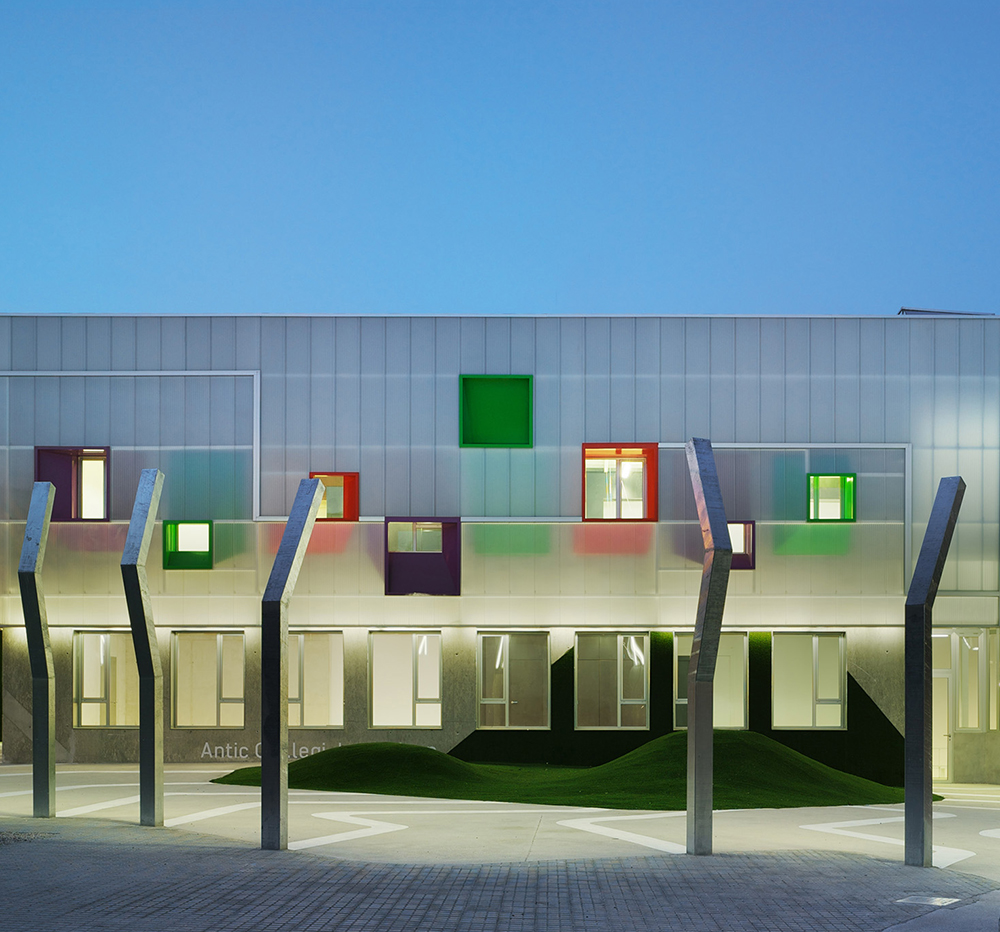
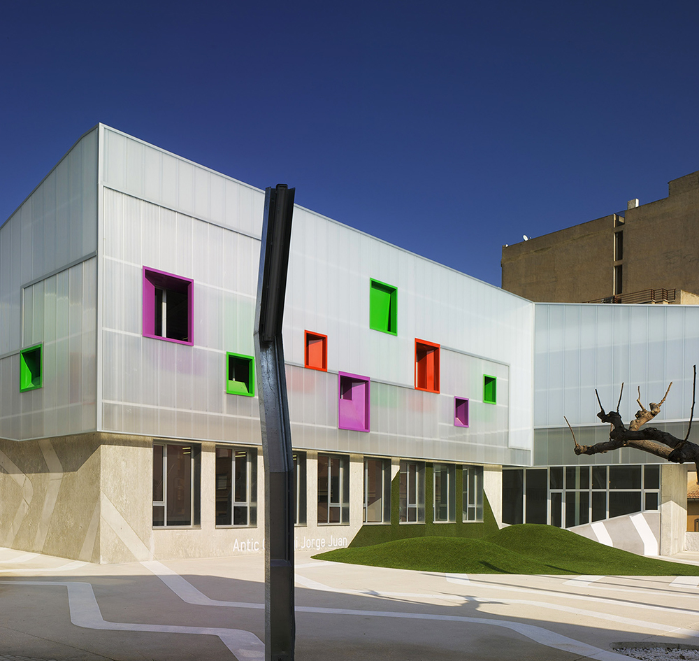
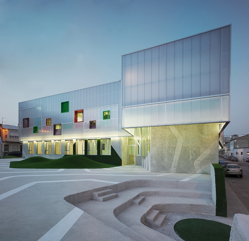
The approach to the Youth Center is a confrontation with a color-canvas duality and a perceptual modification. Windows are framed in shades of solid bright colors, and offset to keep the eyes moving while surveying the glassy and glossy transparent facade. The other noticeable use of color is the lawn, which is landscaped into plump, rolling knolls directly in front of the building. The green of the lawn slopes over these hills, before sloping up the sides of the building itself, breaking the horizontal-vertical axis; and not only here, but elsewhere too, in the alleys outside, and in the courtyard wall of the amphitheater entrance-way. The concrete surrounding the lawn areas is tattooed with tribal, primitive, Nazca-like lines that also break the horizontal-vertical planes: here traveling across the ground and crawling up the walls of the Youth Center, and there materializing into surreal metal columns in the courtyard proper. These perceptual modifications play with the fluidity of objects within a confined volume.
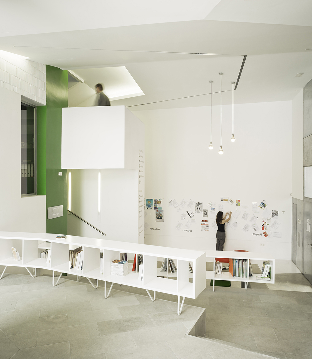
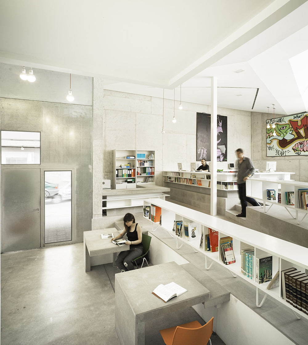
Volume is indeed a key component of the Youth Center, with rhomboid and cuboid architecture reflecting the desire to create wide open interior spaces, not just modifications of the exterior ones. Interior spaces mesh the industrial with the sophisticated. Smooth concrete floors transform into smooth concrete walls and smooth concrete tables without changing the type of structural material for even a moment. Bookcases are placed at the eye level of those sitting down at these tables, but they are at foot level for the mid-level section of the room lying a few feet higher, accessible via steps. More steps lead to the highest section a few feet above that, wherein lies the administrative desks as well as more bookcases. It’s not quite a mezzanine layout, more of a tiered one, which has been seen in other youth-oriented designs as a method of increasing young people’s visibility, which is empowering for them.
Administrative areas such as the conference room are laid out with the same attention to volume while never breaking the essential industrial mold of corrugated roofing and concrete floors. Conference tables are on wheels, moveable throughout the entire exterior space as seen fit. The central location of a traditional conference table is conveyed much more in the highlighted section of concrete into whose outline the table “fits” more than in the actual location of the table at any given time. This highlight effect also augments the flooring on a stylistic level.
The courtyard and interior are almost Dali-esque spaces that witness the simultaneous placement of single, unified, solid objects across conjoined vertical and horizontal surfaces. Crystalzoo has fleshed out a dynamic space like this from a pre-existing urban structure, the new building discoursing with the old and with the culturally-attuned urban area in which it lies.
